Bright Winter Color Palette: Vivid Swatches, Workwear & Lips
Master the bright winter color palette with contrast benchmarks, vivid jewel hex swatches, lip shades, and a 6-season wardrobe comparison table.
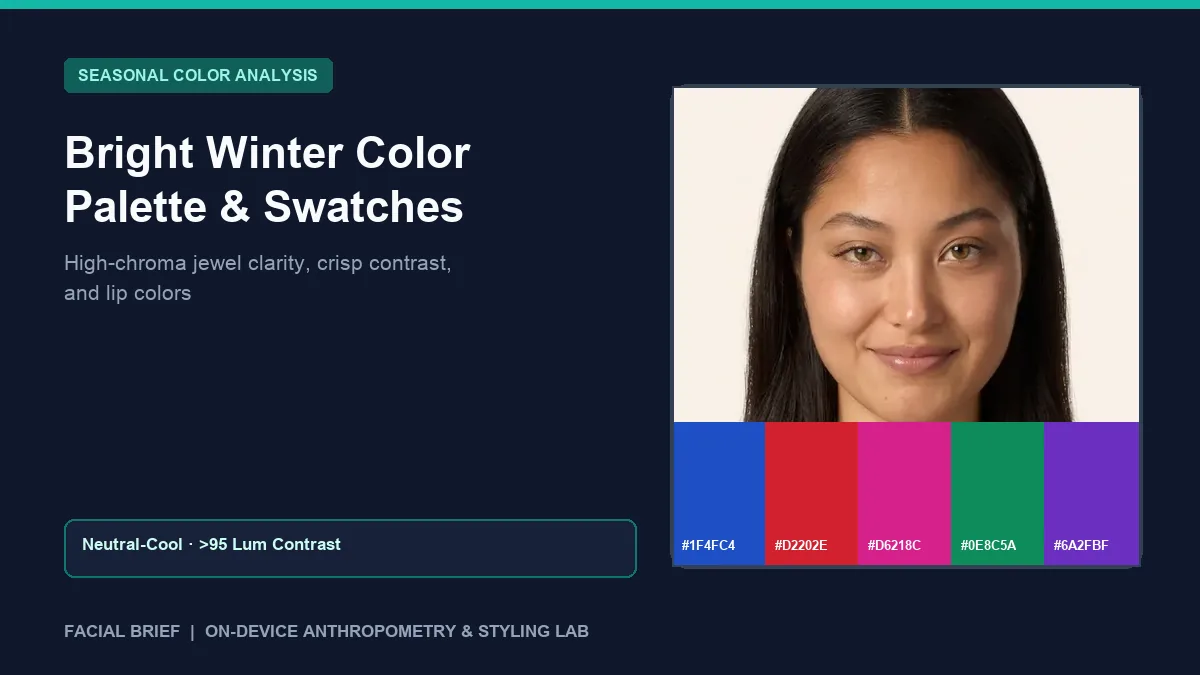
The bright winter color palette sits at the electric boundary between Winter coolness and Spring clarity, governed first by high chroma saturation and second by a cool-neutral undertone. On r/coloranalysis and r/WinterColorAnalysis, newly draped Bright Winters (sometimes called Clear Winters) describe feeling startled twice over: first by a fan packed with cobalt, hot magenta, and vivid cherry red that look suited to stage wear on a hanger, and second by how quickly heather gray or oatmeal beige leaves their face looking tired. Before buying bright staples or clearing out neutral basics, you can measure undertone lean, complexion depth, and hair-to-skin luminance contrast from a daylight portrait when you Run Color Analysis Free right in your browser.
Key Takeaways
- High clear chroma leads the bright winter color palette ahead of icy coldness, placing neutral-cool clarity above muted gray or dusty earth toning.
- Facial Brief pixel sampling assigns Bright Winter where neutral skin warmth (
28 to 48red-minus-blue difference) pairs with strong hair-to-skin contrast (> 95luminance delta). - Signature shades center on bright cobalt (
#1F4FC4,#0070E0), true cherry red (#D2202E,#FF1E42), electric fuchsia (#D6218C,#E6005C), vivid emerald (#0E8C5A), and clear violet (#6A2FBF). - Optic white (
#FFFFFF), jet black (#0E1015), bright navy (#112447), and crisp dark charcoal (#363842) outperform oatmeal (#B59E83), warm camel (#9B876A), and olive taupe. - Sheer-diluted cherry reds, cool purple-pink blushes like Clinique Pansy Pop, and crisp black tightlining balance weekday makeup without looking theatrical.
Colorimetry and Contrast Thresholds Behind Bright Winter Colors
Within the Munsell color-order system, seasonal palettes divide along hue (warm versus cool temperature), value (lightness versus depth), and chroma (purity versus muted grayness). Whereas True Winter leads with pure blue coldness and Deep Winter leads with dark depth, bright winter colors lead with clear chroma. Pigments carry minimal gray or brown dilution, sitting right beside Bright Spring at the highest saturation edge of the 12-season wheel.
In daylight portrait analysis, Facial Brief samples cheek and forehead pixels and assigns Bright Winter through neutral-leaning warmth (meanR - meanB in the 28 to 48 band, cooler than warm Spring's > 48 threshold) combined with sharp luminance separation between skin and hair (lumDelta > 95). Strong contrast between clear eye whites, dark lashes or brows, and crisp skin lets vivid hues sit cleanly below the chin instead of overpowering your face.
Online charts often show Bright Winter exclusively as pale skin with blue-black hair and icy blue eyes. Community threads like this r/coloranalysis post for atypical Bright Winters document plenty of exceptions, including medium olive complexions, deep dark skin tones, and chestnut or dark ash-blonde hair paired with vivid hazel or emerald irises. The constant across all skin depths is clarity that dulls inside dusty beige. Draping cloth beside a north-facing window between 10:00 AM and 2:00 PM avoids camera white-balance shifts before paying $100 to $300 in person ($75 to $150 online).
Bright Winter vs. Bright Spring, True Winter, and Deep Winter
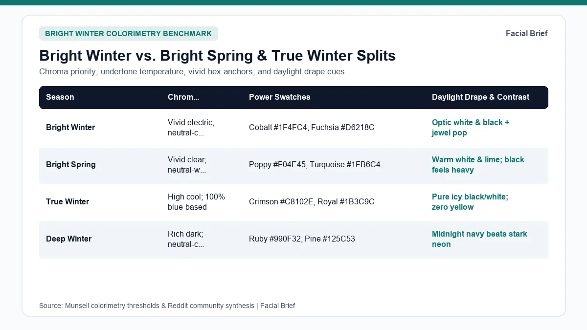
Mis-typing around the bright winter color palette clusters around two crossroads: cool-neutral Bright Winter versus warm-neutral Bright Spring, and vivid Bright Winter versus icy True Winter or dark Deep Winter. The six-season comparison table below sets out temperature bounds, hex codes, and drape tie-breakers.
| Season | Undertone & Temperature | Chroma & Contrast | Signature Hex Swatches | Neutrals & Dealbreaker Test |
|---|---|---|---|---|
| Bright Winter | Neutral-cool (28 to 48) | Electric vivid; > 95 delta | Cobalt #1F4FC4, Red #D2202E, Fuchsia #D6218C, Emerald #0E8C5A | White #FFFFFF, navy #112447, black #0E1015; camel dulls skin |
| Bright Spring | Neutral-warm (> 48 edge) | Sunny vivid; > 95 delta | Poppy #F04E45, Turquoise #1FB6C4, Apple #7CB53A, Pink #E1418D | Navy #1E3758, warm white #F9F7F2; bright gold; black feels heavy |
| True Winter | 100% Cool (< 28 warmth) | Crisp pure; > 95 delta | Crimson #C8102E, Cobalt #1B3C9C, Emerald #0C7A50, Magenta #C0148C | Black #141418, optic white #FFFFFF; silver; slight yellow clashes |
| Deep Winter | Neutral-cool (Autumn edge) | Dark clear; < 120 deep lum | Ruby #990F32, Pine #125C53, Plum #4E1D6E, Sapphire #1D428A | Midnight #17243D, noir #14161B; gunmetal; icy pastels look stark |
| True Summer | 100% Cool (< 28 warmth) | Medium-soft; 48 to 95 | Cornflower #4272B8, Rose #C74E8E, Raspberry #B23A66, Teal #3E8896 | Cool navy #293548, alabaster #EEF0F3; electric neon overwhelms |
| True Autumn | 100% Warm (> 48, Y-YR) | Medium-muted; 48 to 95 | Terracotta #B94E2C, Ochre #D08C28, Olive #4E6E48, Teal #28666E | Espresso #473422, cream #E2D2B5; gold; fuchsia looks disconnected |
Bright Winter vs. Bright Spring: The Sister Season Split
Choosing between Bright Winter and Bright Spring creates heavy traffic on chroma threads like this r/coloranalysis debate on Bright Spring vs. Bright Winter. Both palettes rely on high saturation and share electric emerald and turquoise tones, so mutedness tests fail quickly.
Temperature and solid black decide the call in daylight. Drape cool fuchsia (#D6218C) and optic white (#FFFFFF) opposite warm poppy orange-red (#F04E45) and yellow-lime (#7CB53A), then repeat with jet black (#0E1015). Bright Springs glow in lime and coral-red while solid black feels heavy under their chin; Bright Winters sharpen in fuchsia, icy blue, and black-and-white contrast while yellow-green turns their complexion sallow. Compare the warm sister edge in our bright spring color palette guide or inspect earthy opposites in our true autumn color palette guide.
Bright Winter vs. True Winter and Deep Winter
Separating the three Winters appears clearly in this r/coloranalysis comparison of Winter subtypes and this r/coloranalysis Q&A on Bright Winter rules. True Winter rejects even slight warmth and demands icy blue clarity, whereas Bright Winter borrows minor neutral warmth from Spring while pushing saturation higher. Deep Winter favors darker burgundy and pine (#125C53) over neon cyan (#0099CC). Check pure cool anchors in our true winter color palette guide, softer cool bounds in our true summer color palette guide, or map your contrast score inside the 42-Metric Full Report.
Building a Bright Winter Wardrobe Palette for Work and Daily Wear
Getting typed into Bright Winter introduces a workplace headache softer seasons miss: dressing for conservative offices without looking dressed for evening cocktails.
Taming Neon Energy for Conservative Offices
Corporate dressers in this r/coloranalysis thread on non-bright office wear and this r/coloranalysis discussion on bright-color comments note that loud brights stand out inside gray rooms. A functional bright winter wardrobe palette keeps restraint through dark-and-light contrast:
- Anchor suits and coats in navy (
#112447), deep charcoal (#363842), optic white (#FFFFFF), and jet black (#0E1015), dropping oatmeal (#B59E83), camel (#9B876A), and heather gray. - As this r/coloranalysis thread on customizing Bright Winter notes, flat black reads softer when broken by white collars, crisp stripes, or bright silver.
- Wear deeper jewel tones for meetings: emerald teal (
#0E8C5A), cobalt (#1F4FC4), deep violet (#6A2FBF), and clear burgundy. - Favor crisp poplin, mercerized cotton, fine merino wool, silk crepe, and structured ponte over slub linen or fuzzy tweed.
Hair Toning, Metals, and Eyewear
Natural Bright Winter hair runs glossy dark brown, blue-black, or crisp ash. Warm caramel ribbons blunt eye-to-hair contrast; neutral-cool espresso, clear black, or icy platinum keep edges crisp. Preview hair contrast shifts using Facial Brief's Hair Color Try-On.
Bright sterling silver, platinum, white gold, and icy stones outshine brushed brass. Pick eyewear in glossy black, crystal clear acetate, cobalt, or dark cool tortoiseshell.
Bright Winter Makeup Colors, Lip Dilution, and Cheek Picks
Beauty counters favor muted rose-browns, warm peaches, and terracotta nudes that turn chalky on Bright Winter skin. Yet swiping full-strength crimson or magenta straight from the tube triggers the worry voiced in this r/coloranalysis thread on everyday Bright Winter makeup: feeling overly dressed on weekday mornings.
Reviews across this r/coloranalysis Bright Winter makeup recommendations thread and this r/coloranalysis Bright Winter lip and blush thread balance bright winter makeup colors through crisp lash framing and sheer-diluted lip pigment:
- Lips: Classic vivid tubes include MAC Ruby Woo and Red Rock, Revlon Cherries in the Snow and Fuchsia Fusion, NYX Monte Carlo, Fenty Gloss Bomb in Hibiscus, and YSL Loveshine Pink Desire. For understated office days, blot a vivid berry or red over clear lip balm (or wear sheer cool balms like Maybelline Rose Bite) to keep clarity without opaque heaviness.
- Cheeks: Skip muted brown-peach blushes that oxidize orange. Community picks favor cool bright tones tapped lightly: Clinique Cheek Pop in Pansy Pop (vivid lilac-pink that blends into a crisp cool flush), Patrick Ta She's a Doll, e.l.f. Bright Pink, and RMS French Rose.
- Eyes and base: Keep eyelids clean with neutral primer, icy taupe sheen, crisp black mascara, and neat upper-lash tightlining while bright lips anchor contrast.
Inspect how jewel swatches, contrast scores, and lip tones map onto a complete profile in our sample facial report.
Frequently Asked Questions
Can a Bright Winter look good without wearing neon colors every day?
Yes. Crisp edge separation and clear pigment depth matter far more than neon intensity. Anchoring everyday outfits in pure optic white (#FFFFFF), bright navy (#112447), deep charcoal (#363842), and crisp jet black paired with small doses of royal cobalt (#1F4FC4), cherry red, or deep emerald preserves facial brightness cleanly without drawing unwanted attention inside conservative corporate offices, legal firms, or minimalist creative workplaces.
How can I tell Bright Winter apart from Bright Spring?
Drape clear cool fuchsia (#D6218C), icy white (#FFFFFF), and solid black (#0E1015) beside warm poppy red (#F04E45) and yellow-lime (#7CB53A) in indirect north window light without wearing makeup. Bright Winter skin brightens cleanly in fuchsia and crisp black-and-white contrast, whereas Bright Spring glows in yellow-green and warm coral while solid black casts flat dark shadows beneath the jawline and under the eyes.
Why do neutral nude lipsticks look muddy on Bright Winters?
Most mainstream nude lipsticks rely on beige, peach, or muted gray-brown pigments that sit well below Bright Winter's clear saturation range. Against clear high-contrast features, muted browns look flat, gray, or chalky on camera and in natural daylight. Switching to sheer-applied cherry red, cool berry gloss, or blotted pink-berry tints restores natural lip clarity and balanced facial contrast right away without heavy stage finish.
Can you be a Bright Winter with medium, olive, or deep skin?
Yes. Although textbook illustrations often show fair skin and dark black hair, Bright Winter spans fair, medium, cool olive, and deep dark complexions across all backgrounds and diverse ethnicities. The defining traits combine neutral-cool skin undertones with crisp high luminance separation between skin, hair, and bright eye whites, plus clear skin radiance that dulls immediately inside dusty oatmeal, warm camel, or tan beige knitwear.
Referenced Community Discussions & Sources
- r/coloranalysis: Core questions on Bright Winter contrast and black balance: Clarifies chroma priority and dark basics balance.
- r/coloranalysis: Customizing Bright Winter beyond solid head-to-toe black: Breaks down pairing black with crisp white and navy.
- r/coloranalysis: Subtle non-neon office wear strategies for Bright Winters: Details navy, charcoal, crisp white, and deep jewel layering.
- r/coloranalysis: Profiles of atypical olive, medium, and lighter-haired Bright Winters: Demonstrates clarity-driven typing across diverse skin tones.
- r/coloranalysis: Telling Bright Winter apart from Bright Spring in daylight: Contrasts cool magenta and black against warm coral and lime.
- r/coloranalysis: Bright Winter lipstick and cool blush favorites: Covers MAC Ruby Woo, Fenty Hibiscus, and Clinique Pansy Pop.
- Colorimetry Standards: Munsell Color-Order System (ASTM D1535) chroma, value, and hue axes alongside CIE Rec. 709 relative luminance calculation.
Paired Facial Brief Analyzer
Measure your own proportions on-device
Run private 478-point landmark geometry in your browser with zero server photo upload on free tools.
Continue Reading