Bright Spring Color Palette: High-Chroma Shades & Fit
Master the bright spring color palette with chroma benchmarks, hex swatches, makeup tips, and a 6-season comparison table for clear contrast.
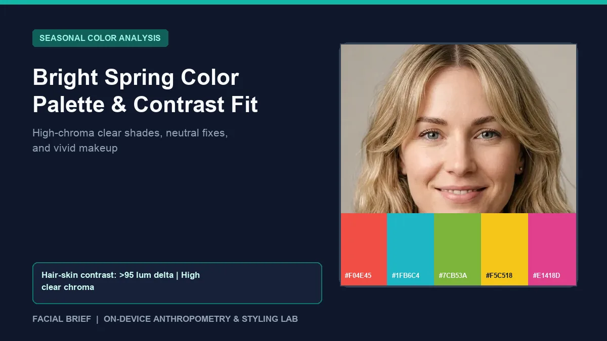
The bright spring color palette occupies the high-saturation edge between Spring warmth and Winter intensity, led first by crystal-clear chroma and second by a warm-neutral undertone. On r/SpringColorAnalysis and r/coloranalysis, newly typed Bright Springs (often called Clear Springs, or Paintbox Springs in House of Colour) describe a specific shock: after years in black, heather gray, or dusty beige, receiving a fan of electric turquoise, hot watermelon, and poppy red feels intimidating. People worry they will look like a neon sign, yet muted earth tones wash them out while pure saturated hues bring immediate clarity to their eyes. To measure your hair-to-skin contrast delta and undertone lean from a daylight portrait before testing swatches, Run Color Analysis Free inside your browser.
Key Takeaways
- High clear chroma leads the bright spring color palette ahead of extreme yellow warmth, so pure unmuddied shades harmonize while dusty or gray-toned hues flatten the skin.
- Core high-impact swatches center on bright poppy (
#F04E45), vivid turquoise (#1FB6C4), apple-lime green (#7CB53A), sun yellow (#F5C518), and hot watermelon (#E1418D). - Facial Brief pixel sampling links Clear Spring profiles to high hair-to-skin luminance contrast (
> 95delta on a 0 to 255 scale), medium skin depth (120 to 188), and warm-to-neutral undertones. - Muted warm neutrals like oatmeal, camel, and mustard dull Bright Spring skin, making bright navy (
#1E3758), crisp warm white (#F9F7F2), and deep clear charcoal (#2B2C32) cleaner anchors. - Luminous skin tints, clear coral-red or watermelon lipsticks, and punchy tropical cream blushes outperform chalky pale-peach makeup and heavy matte foundations.
Colorimetry and Contrast Behind Bright Spring Colors
Under the Munsell color-order system, every seasonal palette balances hue (temperature), value (lightness to darkness), and chroma (purity versus gray muting). While True Spring is driven by yellow warmth, Bright Spring is driven by chroma. Bright spring colors hold minimal gray, brown, or dusty white softening. Sitting next to Bright Winter on the 12-season wheel, the palette leans neutral-warm so clean emerald (#00A676), cobalt blue (#1F78D1), and clear hot pink (#E63C8C) work alongside warm tangerine and bright coral.
In Facial Brief pixel sampling across cheeks, forehead, and hairline, Clear Spring profiles typically display high luminance contrast between hair and skin (lumDelta > 95) paired with medium skin luminance (120 to 188) and warm-to-neutral red-over-blue balance. High visual contrast between dark hair, bright sclera, and clear skin tone allows the face to hold intense color without disappearing behind the fabric.
Reddit threads debunk the stereotype that Springs must be pale, blonde, and freckled. As members note in r/SpringColorAnalysis discussions on Bright Spring misconceptions, "clear" means pure unmuddied pigment, and many Bright Springs have dark brown or black hair with hazel, green, or amber eyes. Comparisons between House of Colour Paintbox Spring and 12-season Clear Spring fans show minor differences on black tolerance, while both agree dusty fabrics drain focus.
Testing requires indirect window daylight between 10:00 AM and 2:00 PM because indoor LEDs flatten eye contrast on camera. In-person draping studios charge $100 to $300 ($75 to $150 online), so checking our true spring color palette guide beside Winter swatches first saves guesswork.
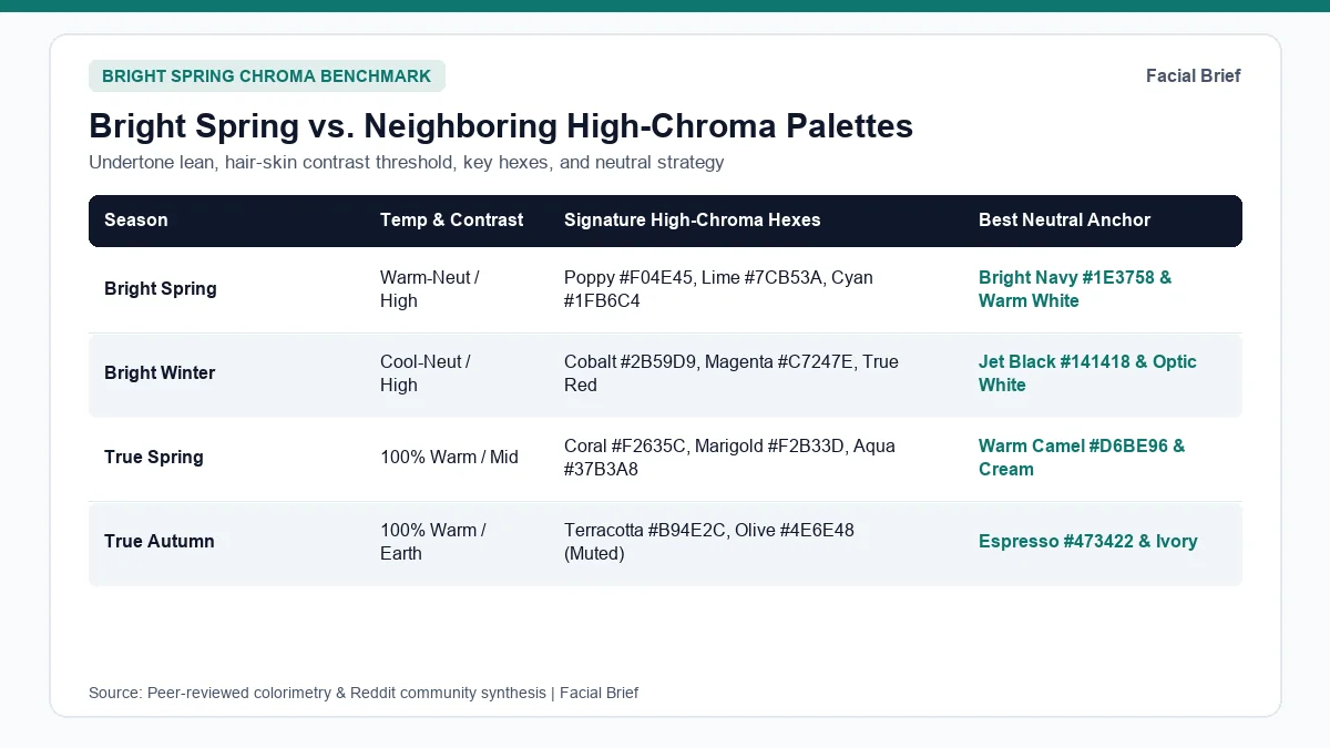
Bright Spring vs. Bright Winter and True Spring
Border confusion around Bright Spring happens because it shares high saturation with Bright Winter while sharing warmth with True Spring. The table below compares the bright spring color palette with its closest high-chroma and warm neighbors.
| Season | Undertone & Temperature | Chroma & Contrast | Signature Swatches & Hex Codes | Neutrals & Colors to Avoid |
|---|---|---|---|---|
| Bright Spring | Neutral-warm (Winter border) | Very high clear; > 95 lum delta | Poppy #F04E45, Turquoise #1FB6C4, Apple #7CB53A, Pink #E1418D | Bright navy #1E3758, warm white #F9F7F2; avoid muddy taupe #A1978E and oatmeal |
| Bright Winter | Neutral-cool (Spring border) | Very high icy; extreme contrast | Cobalt #2B59D9, Fuchsia #C7247E, True red #C21F39, Cyan #2AA9D9 | Jet black #141418, optic white #FFFFFF; avoid warm tan, rust, and camel |
| True Spring | 100% Warm (golden Y to YR) | High sunny; 48 to 95 lum delta | Coral #F2635C, Leaf #6FA843, Marigold #F2B33D, Aqua #37B3A8 | Warm camel #D6BE96, cream ivory #F6EED9; avoid cool slate and stark black |
| True Autumn | 100% Warm (golden Y to YR) | Medium-muted earthy; mid-deep | Terracotta #B94E2C, Ochre #D08C28, Olive #4E6E48, Teal #28666E | Espresso #473422, warm cream #E2D2B5; avoid icy pastels and neon brights |
| Light Summer | Cool-neutral (Spring border) | Light airy; < 95 lum delta | Sky #A9C6E8, Blush #DCA0AC, Lavender #BBA8D8, Mint #A5D8C3 | Soft charcoal #5C6470, dove gray #D3D7DF; avoid jet black and burnt orange |
| Soft Autumn | Warm-neutral (Summer border) | Low dusty; soft low contrast | Clay rose #B56357, Sage #6F8C7A, Honey tan #C88A5B | Oatmeal #E8E0D5, warm taupe #8B7765; avoid electric pink and bright cyan |
Telling Bright Spring Apart from Bright Winter
Both sister palettes require high contrast, so draping settles temperature, a central topic in r/coloranalysis Bright Spring vs. Bright Winter threads. Under window daylight, test apple-lime green (#7CB53A) opposite icy emerald, and poppy red (#F04E45) opposite cool magenta (#C7247E). Bright Springs look clearer in yellow-green and warm coral-red while magenta casts gray shadows around the mouth; Bright Winters shine in emerald and magenta while yellow-green turns skin sallow. Solid jet black (#141418) also divides them: Bright Winter handles solid black easily, whereas Bright Spring looks cleaner breaking black with warm white (#F9F7F2).
Telling Bright Spring Apart from True Spring
Once warm clarity beats Winter frost, separating Clear and True Spring comes down to saturation and camel tolerance in r/coloranalysis Bright vs. True Spring comparisons. True Spring leans deeply golden in camel, apricot, and warm coral (#F2635C). On Bright Springs, camel and soft sunset shades flatten contrast, while emerald (#00A676), turquoise (#1FB6C4), and cobalt (#1F78D1) make eyes stand out. Map contrast and undertone distance in our 42-Metric Full Report or inspect muted palettes in the soft autumn color palette guide.
Bright Spring Wardrobe Palette, Neutrals, and Makeup
Building a functional bright spring wardrobe palette starts with fixing the neutral trap. Autumn beige, oatmeal, dusty taupe (#A1978E), and heathered summer grays (#9EA3A1) contain gray-brown muting that dulls crisp contrast. Users trading favorites in r/SpringColorAnalysis favorite Bright Spring color threads consistently favor crisp ivory-white, bright navy (#1E3758), clear charcoal (#2B2C32), cobalt, coral, and emerald green over dusty earth staples.
Transitioning Out of an All-Black Closet
Minimalists typed into Bright Spring often dread giving up monochrome outfits, as voiced in r/coloranalysis posts from Bright Springs who dislike loud color. Wearing head-to-toe electric hues is unnecessary when four practical wardrobe anchors preserve polish:
- Anchor coats, trousers, and knitwear in bright navy (
#1E3758), clear dark charcoal (#2B2C32), or crisp warm white (#F9F7F2) over muddy taupe or heather gray. - Start with "gateway" brights near the collar, such as cobalt blue (
#1F78D1), crisp true red (#F24444), and raspberry pink (#E1418D), before trying sun yellow (#F5C518) or bright lime. - Wear high-contrast black-and-white stripes, polka dots, or sharp houndstooth when craving black, because pattern contrast prevents solid black from dragging down the jaw.
- Pick smooth light-reflecting textiles like mercerized cotton, silk, crisp poplin, and fine gauge wool over matte slub linen or fuzzy tweed.
In hair color, keeping clear contrast between skin and hair matters more than chasing dusty ash tones. Rich golden brown, glossy espresso-bronze, or warm chestnut preserves iris sparkle, whereas muted ash blonde dulls skin clarity. Testing contrast shifts with Facial Brief's Hair Color Try-On checks balance before dyeing.
Bright Spring Makeup Colors, Finish, and Metals
Pale pastel-peach blushes and muted dusty-rose nudes rank among the top complaints in r/SpringColorAnalysis Bright Spring makeup threads. Light peach blushes like NARS Orgasm can read chalky on medium or high-contrast skin, while muted mauve lipsticks look dull. Choosing bright spring makeup colors comes down to pure pigment and glowing finish.
Trade heavy ultra-matte foundations, which mask natural radiance, for luminous skin tints or hydrating foundations. On cheeks, sheer high-pigment liquid or cream blushes like Fenty Beauty Fiya Papaya and bright tropical coral-pinks (Kosas or Rhode Spicy Marg style corals) melt cleanly without white-base chalkiness. Keep eyes simple with clean tightlining and champagne shimmer so a clear poppy-red, warm bright pink, or glossy coral lip anchors facial contrast cleanly.
Bright polished yellow gold, sleek champagne gold, and mixed gold-plus-silver jewelry match the Winter-adjacent warmth of Bright Spring, alongside crystal-clear, bright tortoiseshell, or jewel-toned eyewear frames. Compare high-contrast palettes against light cool tones in our light summer color palette guide or view full swatch cards on our sample facial report.
Frequently Asked Questions
Can a Bright Spring wear black without looking washed out?
Bright Springs handle black better than True or Light Springs due to high natural contrast and Winter adjacency, though solid jet black under a bare face can cast slight under-eye shadows. Break black up with crisp warm white (#F9F7F2) collars, black-and-white prints, or clear coral-red lipstick and bright gold earrings near the jaw. For solid dark basics, bright navy (#1E3758) and clear charcoal (#2B2C32) flatter more consistently.
Why do beige and camel look bad in the bright spring color palette?
Standard camel, oatmeal, and warm beige contain gray-brown muting that falls well below Bright Spring's saturation threshold. Because chroma leads the palette ahead of pure earthiness, muted warm neutrals dull skin radiance and blur eye clarity. Build neutral outfits around warm white (#F9F7F2), stone cream (#D8D1C2), bright navy (#1E3758), or clear deep charcoal, then add warmth through saturated accessories or lipstick.
How do I know if I am Bright Spring or Bright Winter?
Compare warm brights opposite icy cool brights beside a north-facing window with bare skin. Alternate apple-lime green (#7CB53A) and poppy tomato red (#F04E45) against icy emerald and cool magenta (#C7247E). When warm green and coral-red smooth skin texture and brighten irises while cool magenta leaves your jawline gray, Bright Spring fits best. When stark black and icy silver shine while yellow-green turns sallow, choose Bright Winter.
What makeup finishes work best for bright spring makeup colors?
Clear, luminous, and satin-gloss finishes consistently outperform powdery mattes on Bright Spring skin. Heavy matte foundations flatten natural light reflection, and chalky pastel lipsticks fight high contrast. Choose glowing skin tints, sheer bright liquid or cream blushes in tropical coral and poppy tones, minimal champagne eyelid definition, and clear glossy coral, watermelon, or warm true-red lips that echo natural saturation effortlessly.
Referenced Community Discussions & Sources
- r/SpringColorAnalysis: Clearing up common misconceptions about Bright Spring: Explains why clear chroma outweighs neon glare, why brunettes fit Bright Spring, and why camel dulls contrast.
- r/coloranalysis: Surviving bright colors when you prefer dark minimalist outfits: Outlines gateway shades like cobalt and raspberry alongside navy and charcoal anchors.
- r/SpringColorAnalysis: Top real-world favorite colors for Bright Springs: Lists staples including bright coral, hot pink, apple green, turquoise, and poppy red.
- r/SpringColorAnalysis: High-chroma Bright Spring makeup and blush picks: Notes why pale peach blushes read chalky and picks luminous tints with coral blushes like Fiya Papaya.
- r/coloranalysis: Live draping differences between Bright Spring and Bright Winter: Tests lime versus emerald, coral-red versus magenta, and stark black.
- r/coloranalysis: Separating Bright Spring from True Spring drapes: Contrasts chroma-first clear brights with warmer, softer True Spring sunset hues.
- r/SpringColorAnalysis: Comparing Paintbox Spring and 12-season Clear Spring fans: Examines black and neutral overlap between Paintbox Spring and 12-season Clear Spring.
- Munsell Color-Order System (ASTM D1535): Colorimetric standard specifying chroma, value, and hue axes behind 12-season thresholds.
Paired Facial Brief Analyzer
Measure your own proportions on-device
Run private 478-point landmark geometry in your browser with zero server photo upload on free tools.
Continue Reading