True Winter Color Palette: Cool Swatches, Contrast, and Makeup
Explore the true winter color palette with hex codes, blue-based lipsticks, casual outfit fixes, and a 6-season table comparing cool winter subtypes.
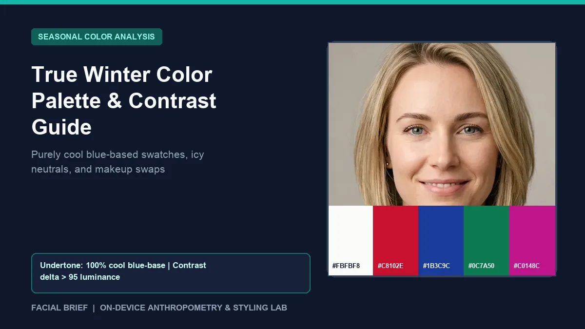
Stepping into the true winter color palette often feels counterintuitive when you first open a swatch fan. On r/coloranalysis, newly typed users describe feeling overwhelmed by jewel blues, stark optic white, and jet black that look like eveningwear on a hanger, yet clear away facial redness and brighten eye whites the second they touch daylight skin. Unlike neighboring seasons that borrow slight warmth from Spring or Autumn, true winter sits at the coldest point of the 12-season color wheel, defined by pure blue undertones, crisp clarity, and dramatic light-to-dark contrast. To verify your skin temperature, luminance delta, and seasonal match from a natural-light portrait before buying new staples, Run Color Analysis Free directly in your browser.
Key Takeaways
- The true winter palette is governed first by 100 percent cool temperature (zero yellow, peach, or golden earth tones), followed by high chroma clarity and sharp light-dark contrast (
luminance delta > 95between skin and hair). - Signature anchors combine optic white (
#FBFBF8to#FFFFFF) and true jet black (#141418) with saturated blue-based jewel tones: crimson red (#C8102E), royal cobalt (#1B3C9C), true emerald (#0C7A50), and cool magenta (#C0148C). - People searching for a true deep color palette often split between True Winter (icy, crisp, zero warmth) and Deep Winter or Deep Autumn (heavier dark value with neutral flexibility).
- Passing the stark black fabric test in indirect daylight separates True Winter from True Summer: True Winter skin tightens and sharpens against pure black, whereas muted Summers look shadowed or heavy.
- Mainstream makeup counters skew warm-brown and dusty-mauve, so true winter makeup focuses on blue-based berry reds, cool pink blush, clean black liner, and zero warm bronzer.
Colorimetry behind the true winter color palette
Personal colorimetry splits every fabric and pigment along three Munsell axes: hue (warm vs. cool temperature), value (lightness vs. darkness), and chroma (clarity vs. grayed softness). Within the 12-season framework, the true winter color palette occupies the pure cool anchor of the Winter family. Every true winter color carries a clean blue or cool violet undertone without yellow softening.
When Facial Brief analyzes daylight facial samples, True Winter profiles show cool skin pixels (red-minus-blue warmth < 28), clear light-to-medium luminance (skin luminance >= 120 on a 0 to 255 scale), and wide contrast separation (luminance delta > 95) between skin and dark hair or brows. In human terms, that often pairs alabaster, porcelain, cool olive, or cool espresso skin with dark brown, charcoal, or blue-black hair and distinct iris contrast, although fair-to-deep skin tones across any ethnicity can belong to true winter when cool clarity dominates.
Note one frequent terminology quirk discussed in this r/coloranalysis thread comparing Cool Winter and True Winter. In 12-season systems, True Winter and Cool Winter name the exact same season. In 16-season Sci/ART-inspired variations, some analysts separate Cool Winter (leaning closer to Cool Summer, slightly softer contrast) from True Winter (dead-center Winter balance of temperature, depth, and chroma). Either way, warmth remains completely absent from true winter colors.
The pure black test and true winter contrast
Before buying cobalt coats or magenta knits, Reddit analysts rely on one quick diagnostic discussed in this r/coloranalysis dealbreaker thread for True Summer vs. True Winter. Drape a matte jet-black shirt and a crisp optic white tee directly below your bare collarbone in north-facing daylight, then compare them against medium heather gray and soft off-white.
True Winters come alive in stark black and bright white. Jawline shadows look cleaner, under-eye circles recede, and eye whites appear brighter because your natural contrast matches the visual jump between #FFFFFF and #141418. True Summers, despite sharing a cool blue undertone, carry muted gray softness; pure black pulls dark shadows under their chin and makes the shirt appear detached from their face.
That same temperature sensitivity trips up shoppers looking for a true deep color palette. Deep value without blue clarity turns muddy fast on a True Winter. Earthy oxblood, camel, and burnt terracotta make cool skin look sallow or jaundiced, which is why testing warmth tolerance against our deep autumn color palette guide clarifies whether your depth leans warm-neutral or ice-cold.
Digital palettes and daylight drape verification
Picking fabric online is harder than it looks because smartphone cameras shift color temperature automatically. Across this r/coloranalysis digital palette guide thread, community members consistently recommend Sci/ART-aligned physical swatch fans from True Colour International (TCI) alongside The Concept Wardrobe's structured true winter palette charts. Avoid judging colors from indoor LED mirror selfies, where auto-white-balance warms cool skin tones and washes royal blue into dull slate.
True winter colors vs. neighboring cool and deep seasons
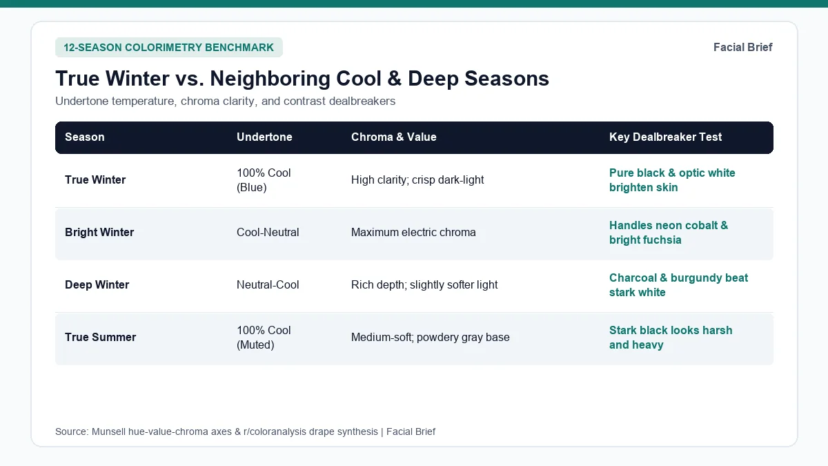
Mis-typing along the cool and high-contrast edges happens frequently. Use the six-season comparison table below to pinpoint how true winter colors separate from Bright Winter, Deep Winter, cool Summer variants, and warm-neutral Deep Autumn.
| Season | Undertone Temperature | Chroma & Value Axis | Signature Hex Swatches | Neutrals & Metal Finish | Dealbreaker Drape Test |
|---|---|---|---|---|---|
| True Winter | 100% Cool (pure blue) | High clarity; sharp light-dark contrast | White #FBFBF8, Crimson #C8102E, Cobalt #1B3C9C, Emerald #0C7A50, Magenta #C0148C | Jet black, optic white, sharp navy; polished silver, platinum | Pure black and optic white brighten skin cleanly |
| Bright Winter | Cool-neutral (leans Spring) | Maximum electric chroma; high contrast | Bright cobalt #2B59D9, True red #C21F39, Cool fuchsia #C7247E | Crisp black, white, bright navy; bright silver, white gold | Neon-adjacent brights flatter without overpowering |
| Deep Winter | Neutral-cool (leans Autumn) | Very deep value; dark cool chroma | Midnight #1F2E4D, Ruby #9E1F34, Deep pine #165C47 | Charcoal noir, espresso black, deep navy; pewter, silver | Dark burgundy beats stark optic white alone |
| True Summer | 100% Cool (pure blue) | Medium-soft chroma; light-to-mid value | Cornflower #6584BA, Raspberry #B65479, Dove gray #A8B0BA | Cool navy, soft alabaster, gray; brushed silver | Stark black looks heavy; soft slate wins |
| Soft Summer | Cool-neutral (muted) | Low dusty chroma; soft gentle contrast | Dusty rose #C58F98, Slate #6F839C, Cool sage #8FA395 | Cocoa taupe, stone cream, soft navy; pewter, brushed silver | Bright royal blue overwhelms facial features |
| Deep Autumn | Neutral-warm (deep) | High depth; warm earthy saturation | Mahogany #7C2D26, Espresso #5B3A28, Moss #565A2E, Teal #1F5F63 | Espresso, warm ivory, dark pine; antique gold, bronze | Warm espresso outperforms cool jet black |
If you feel drawn to crisp black yet find bright fuchsia or royal cobalt too theatrical on your skin, examine the muted cool end in our soft summer color palette guide or compare how Deep Winter bridges dark depth in this r/coloranalysis Deep Winter vs. True Winter comparison. On the opposite warm-light extreme sits the light spring color palette guide, where delicate peach and buttercream replace icy contrast entirely. For personalized wear-and-avoid cards mapped to your exact facial contrast, inspect our sample report or unlock the 42-Metric Full Report.
Everyday wardrobe, true winter makeup, and hair toning
Understanding your palette on screen is easy; styling it for grocery runs and office Zoom calls takes deliberate neutral balance.
Solving the formalwear dilemma in casual outfits
One recurring frustration in this r/coloranalysis outerwear and casualwear discussion is that head-to-toe jewel tones can feel dressed up for casual errands. A royal blue trench over an emerald sweater draws attention fast. Casual true winter wardrobes look effortless when you anchor outfits with cool dark neutrals and reserve high-chroma shades for one focal point.
Use sharp navy (#1D2C52), deep charcoal wool, dark indigo raw denim, crisp black cotton, and icy white (#FBFBF8) tees as daily basics. Then place one true winter color focal piece near the collar, such as an icy blue shirt (#CFE3F2), crimson knit, or silver hardware, keeping outfits crisp without feeling overdressed.
True winter makeup, metals, and platinum maintenance
Standard cosmetic displays lean heavily toward warm bronzers, peach blushes, and muted mauve lipsticks, which read muddy on cool skin. Contributors in this r/coloranalysis True Winter makeup favorites thread build routines around blue-based clarity instead: Revlon Cherries in the Snow lipstick for punchy blue-red balance, sheer cool pink blush such as NYX Buttermelt in My Butta Half, crisp black tightlining over bare lids or custom cool silver-taupe eyeshadow from indie makers like Dandy Lions Cosmetics, and bright sterling silver or platinum jewelry. For hair dye, maintain cool espresso, blue-black, or icy platinum blonde using violet toning shampoos and shower filters to block yellow brassiness.
Frequently Asked Questions
What is the difference between True Winter and Cool Winter?
In standard 12-season color analysis, True Winter and Cool Winter are two labels for the same palette built on 100 percent blue undertones and crisp light-dark contrast. Some 16-season Sci/ART frameworks split them slightly, placing Cool Winter closer to Summer with gentler contrast while keeping True Winter at dead-center Winter intensity, though both seasons reject warm yellow-based earth tones completely.
Can a True Winter wear olive green or camel?
Warm olive moss and golden camel clash visibly with a True Winter complexion because both carry yellow undertones that cast sallow gray shadows under the eyes and along the jawline. When shopping for greens or light neutrals, trade warm olive for cool emerald (#0C7A50) or deep blue-pine, and swap camel coats for icy silver-gray, crisp pewter, or optic white (#FBFBF8).
Do all True Winters have pale skin and black hair?
No. While high-contrast pale skin with black hair is the textbook illustration, True Winter spans fair, medium, cool olive, and deep dark complexions across every ethnic background. Analysts diagnose True Winter from pure blue skin undertone paired with crisp luminance separation between natural skin, brow color, and eye clarity rather than relying on skin lightness or dark hair dye alone.
What everyday true winter makeup works without looking overly dramatic?
Keep eye definition clean with black mascara, charcoal tightlining along the upper lash line, and a light wash of icy silver or cool taupe shimmer rather than heavy smoky lids. Pair minimalist eyes with blotted cool berry balm, sheer blue-red stain, and a light sweep of cool pink blush so facial contrast stays crisp and natural for daytime errands or office lighting.
Referenced Community Discussions & Sources
- r/coloranalysis: Comparing Cool Winter vs. True Winter across 12- and 16-season systems: Clarifies how pure blue temperature anchors True Winter while 16-season branches adjust softness toward Summer.
- r/coloranalysis: The pure black dealbreaker test for True Summer vs. True Winter: Documents how stark black and optic white clarify True Winter skin while overwhelming muted Cool Summers.
- r/coloranalysis: Recommended digital fans and Sci/ART references for True Winter: Compares True Colour International (TCI) physical systems and The Concept Wardrobe digital guides for accurate swatch matching.
- r/coloranalysis: Navigating outerwear and everyday casual outfits in True Winter: Offers neutral-balancing strategies so bright cobalt and emerald feel natural for casual daily wear.
- r/coloranalysis: Community-tested lipsticks, blushes, and eye palettes for True Winter makeup: Highlights blue-based berry reds, cool pink blushes, and avoiding muddy warm browns around the eyes.
- r/coloranalysis: Separating Deep Winter from True Winter undertones and white tolerance: Contrasts Deep Winter's neutral-cool warmth tolerance against True Winter's strict icy clarity.
- Colorimetry Reference: Munsell Color-Order System (ASTM D1535) hue, value, and chroma dimensions applied in seasonal draping methodology.
Paired Facial Brief Analyzer
Measure your own proportions on-device
Run private 478-point landmark geometry in your browser with zero server photo upload on free tools.
Continue Reading