True Autumn Color Palette: Earth Shades, Swatches, and Fit
Master the true autumn color palette with Munsell hue bounds, hex swatches, and a 6-season comparison table for warm clothes, metals, and makeup.
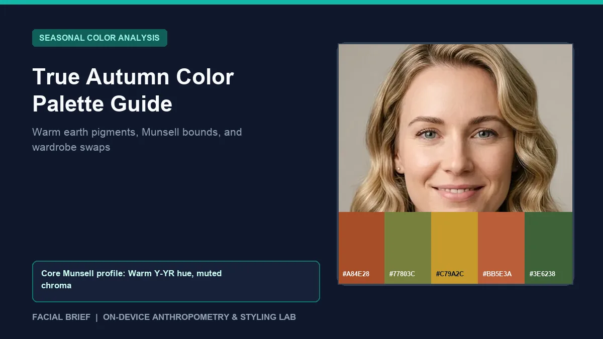
The true autumn color palette sits at the warm center of the 12-season colorimetry system, defined first by golden-yellow undertone and second by medium-muted depth. On color analysis forums like Reddit's r/coloranalysis and r/TrueAutumn, newly typed True Autumns routinely describe an initial wave of disappointment: fans filled with rust, ochre, and moss look dull next to the bright jewel tones and stark black staples dominating mainstream stores. Within weeks of draping real fabrics in daylight, however, that reaction flips as warm spice tones clear under-eye shadows while cool grays leave golden skin looking sallow. To establish your undertone, contrast level, and season fit from a natural-light photo before shopping, Run Color Analysis Free directly inside your browser.
Key Takeaways
- True Autumn sits exclusively on the warm Munsell Yellow to Yellow-Red (Y to YR) hue axis with zero blue-based cool tones, paired with medium-muted chroma and medium-to-dark value.
- Core power pigments center on terracotta (
#B94E2C), warm ochre (#D08C28), olive moss (#4E6E48), brick red (#8F3422), and deep teal (#28666E), anchored by camel (#B89668) and espresso (#473422). - Stark jet black (
#101216) and icy white create sharp gray shadows around golden undertones, making dark espresso, deep moss (#3F4F3C), and warm cream (#E2D2B5) far cleaner wardrobe bases. - Yellow gold, hammered copper, and warm brass merge naturally with warm skin, whereas bright silver and white gold look visually detached.
- Mainstream makeup leans cool, so swapping blue-red and mauve lipsticks for terracotta, brick, and spiced cinnamon tones eliminates the chalky cast True Autumns report on camera.
Colorimetry and Munsell Mechanics Behind True Autumn
Professional 12-season analysts classify palettes across three measurable axes from the Munsell color-order system: hue (temperature), value (lightness to darkness), and chroma (saturation or mutedness). True Autumn, often called Warm Autumn in 16-season frameworks, is led by warmth above all else. In Munsell terms, its hues cluster in the Yellow (Y) and Yellow-Red (YR) ranges, spanning golden amber, warm peach, burnt orange, chestnut, and olive greens mixed with yellow rather than blue. True blue is absent from the palette; blue appears only where yellow shifts it into petrol or warm teal (#28666E).
In chroma and value, True Autumn occupies medium-to-dark depth and medium-low saturation. Pigments carry a slight brown or gray softening so colors feel earthy and organic rather than neon, yet retain noticeably richer warmth than muted Soft Autumn fabrics. When Facial Brief samples cheek and forehead pixels in natural daylight, True Autumn profiles typically show clear red-over-blue warmth alongside medium skin luminance (120 to 188 on a 0 to 255 scale) and moderate hair-to-skin luminance contrast (48 to 95 delta).
One consistent warning across r/TrueAutumn palette reference threads is to distrust digital color wheels and phone selfies shot under indoor LEDs. Automatic white balance in smartphone cameras cools down golden skin and flattens muted olive fabric into dull gray. Testing physical cloth swatches beside a north-facing window between 10:00 AM and 2:00 PM remains the gold standard for confirming whether rich spice shades clarify your jawline or overwhelm it. If your natural hair and brows lean near espresso black and you handle heavier pigment depth without disappearing, compare your contrast against our deep autumn color palette guide.
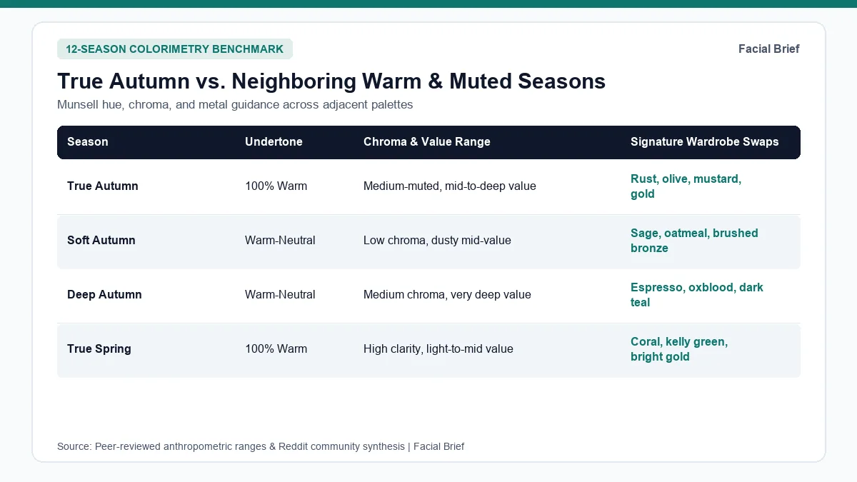
True Autumn vs. Neighboring Seasons: Full Comparison
Mis-typing happens most often along border zones: warm mediums debating between Spring brightness and Autumn earthiness, or muted mediums unsure whether their undertone tilts warm or cool. The comparison table below contrasts the true autumn color palette against its closest warm neighbors and opposite cool benchmarks.
| Season | Undertone & Temperature | Munsell Chroma & Value | Signature Swatches & Hex Codes | Metal Finish & Contrast Rule |
|---|---|---|---|---|
| True Autumn | 100% Warm (golden Y to YR) | Medium-muted chroma; mid-to-deep value | Terracotta #B94E2C, Ochre #D08C28, Olive #4E6E48, Teal #28666E | Yellow gold, copper, brass; medium earthy contrast |
| Soft Autumn | Warm-neutral (flows toward Summer) | Low chroma, dusty; medium value | Sage #6F8C7A, Clay rose #B56357, Warm taupe #8B7765 | Brushed bronze, antiqued brass; gentle low contrast |
| Deep Autumn | Warm-neutral (flows toward Winter) | Medium chroma; very deep dark value | Oxblood #8B261D, Espresso #261C15, Pine #204E4A | Burnished gold, dark bronze; high rich contrast |
| True Spring | 100% Warm (golden Y to YR) | High clear chroma; light-to-mid value | Coral #E06449, Grass green #4F9A69, Marigold #EB9E2E | Bright polished yellow gold; fresh sunny contrast |
| Soft Summer | Cool-neutral (muted rose-slate) | Low chroma, dusty; light-to-mid value | Slate blue #668599, Mauve #8F6F8A, Cool gray #5C606E | Brushed sterling silver, pewter; soft cool contrast |
| True Winter | 100% Cool (icy blue base) | High pure chroma; extreme light-dark value | Crimson #C8083A, Cobalt #0057B8, Pure white #FFFFFF | Polished silver, platinum; sharp crisp contrast |
Separating True Autumn from True Spring and Soft Autumn
The busiest border debate in r/SpringColorAnalysis crossover discussions involves people with golden skin and medium-brown or auburn hair who know they are warm yet swing between Spring and Autumn drapes. Both seasons share warm yellow undertones, so gold jewelry flatters either one. The dividing line is pigment clarity. Hold clear coral (#E06449) beside your face next to muted terracotta (#B94E2C), or bright sunflower yellow beside ochre mustard (#D08C28). True Springs look fresh and awake in clear coral while earthy rust makes them look tired. True Autumns experience the reverse: clear spring brights sit loud and separate in front of their eyes, whereas spice and moss shades bring focus back to facial skin.
Separating True Autumn from Soft Autumn turns on saturation weight. Soft Autumn pulls muted gray-brown softness from Summer, shining in dusty sage and oatmeal (#CBBBA0). Place a true pumpkin or brick red (#8F3422) under the chin: a Soft Autumn looks slightly overpowered by the warm pigment, while a True Autumn gains healthy cheek warmth and sharp iris clarity. Conversely, if you wear cool icy pinks or stark winter shades well, compare the opposite temperature end in our true winter color palette guide or inspect muted cool tones in our soft summer color palette breakdown. Inside Facial Brief's 42-Metric Full Report, pixel luminance deltas map right into a personalized 12-season card with exact neutrals, power colors, and tones to avoid.
Practical Wardrobe, Hair, and Makeup Rules for True Autumn
Reddit threads make one point clear: knowing your palette on paper and dressing for it inside modern clothing stores are two separate hurdles. Many users in r/coloranalysis bright True Autumn discussions confess they initially avoided the season because they assumed it meant wearing beige and brown forever. Looking closely at the full palette breaks that myth quickly. Beyond warm camel (#B89668) and espresso (#473422), True Autumn carries luminous teal (#28666E), mossy forest green (#3E6238), warm apricot, burnt coral, vivid tomato red, and spiced amber (#A46628). Anchoring outfits with olive or warm teal instead of plain tan keeps palettes lively year-round.
Replacing Black Without Losing Edge
Closet grief around losing black tops hits hardest for minimalists and people who favor structured street styles. As discussed across r/TrueAutumn edgy wardrobe threads, ditching stark black does not force a boho wardrobe. Swap jet-black cotton (#101216) for deep espresso leather (#473422), dark moss denim (#3F4F3C), warm charcoal wool, or oxidized bronze hardware. Keeping black below the waist on trousers, skirts, and boots while placing warm cream (#E2D2B5), rust, or camel at the neckline protects facial skin clarity without clearing out half your closet.
Sourcing warm earth tones also depends on retail timing. Because fast-fashion brands lean toward cool white, black, and soft-summer pastels outside September and October, shoppers in r/coloranalysis wardrobe sourcing threads rely on autumn seasonal drops, secondhand marketplaces stocked with 1970s rust and camel tailoring, and palette-indexed retailers like Kettlewell Colours that label garments directly by season.
Makeup, Hair Color, and Metals
Drugstore and prestige cosmetic counters skew heavily toward blue-based reds, cool berry blushes, and stark mauve nudes. On golden True Autumn undertones, cool rose or blue-pink lipstick turns visibly gray or chalky, a frequent complaint documented in r/coloranalysis True Autumn lipstick threads. Switching to warm pigment families improves harmony right away. Choose terracotta, brick red, spiced cinnamon, burnt sienna, warm peach-brown, and muted rust on the lips instead of bubblegum pink or berry-plum. On cheeks and eyes, dusty terracotta, warm apricot, and bronze-peach blushes merge cleanly with cheek warmth, while swapping jet-black mascara and liquid liner for dark chocolate brown or warm bronze frames eyes softly without harsh contrast.
Natural True Autumn hair spans honey blonde, warm chestnut, copper, and golden brown. Reddit colorists warn that platinum ash, cool silver-blonde, or blue-black dye creates a sallow skin cast, whereas honey-caramel or warm copper glosses brighten eye whites. You can preview warm auburn or golden tones on your own portrait with Facial Brief's Hair Color Try-On. Keep jewelry and eyewear frames in yellow gold, hammered copper, brushed brass, amber, citrine, warm matrix turquoise, and cream-champagne pearls.
Frequently Asked Questions
Can a True Autumn still wear black or pure white near the face?
Stark jet black and optical white are the harshest colors against True Autumn warmth because both reflect cool, high-contrast light that accentuates under-eye darkness and uneven skin tone. If you own black blazers or crisp white shirts, layer a camel scarf, rust collar, or yellow-gold necklace right beneath your chin, or keep true black on trousers and shoes while shifting tops toward espresso brown (#473422) and warm cream (#E2D2B5).
How do I tell if I am True Autumn instead of True Spring or Soft Autumn?
Test brightness and mutedness under indirect window daylight. Place clear coral and bright daffodil beside terracotta (#B94E2C) and ochre mustard (#D08C28): if bright spring pigments make your eyes pop while earth tones dull your face, you lean True Spring. If saturated brick and pumpkin look too heavy and dusty sage or rose-taupe harmonizes better, your chroma sits closer to Soft Autumn.
What are the best non-brown colors in the true autumn color palette?
True Autumn extends well past brown and tan into saturated warm greens, warm blues, and fiery spice reds. Standout non-brown options include peacock teal (#28666E), petrol blue, olive moss (#4E6E48), lime-moss (#77803C), warm apricot, tomato red, and golden ochre (#C79A2C). Pairing deep teal tops with antique gold jewelry gives True Autumns strong visual variety without stepping into cool winter territory.
Which lipstick and jewelry shades clash most with True Autumn undertones?
Blue-based ruby reds, bubblegum pinks, frosty lavender, and cool mauve lipsticks commonly look gray or separate against golden skin because blue pigments cancel out warm facial tones. In jewelry, bright chrome, icy sterling silver, and stark white gold tend to stand out sharply rather than melting into the skin, while warm yellow gold, brass, and hammered copper restore healthy surface glow.
Referenced Community Discussions & Sources
- r/coloranalysis: Fun colors and hidden gems beyond brown for True Autumns: Documents the common shock over earthy brown palettes and highlights warm teals, moss greens, coral, and tomato red.
- r/SpringColorAnalysis: Deciding between True Spring and True Autumn: Compares clear brightness versus earthy warmth for medium-brown-haired warm undertones.
- r/TrueAutumn: Building edgy outfits without stark jet black: Details practical swaps using deep espresso, charcoal, olive denim, and textured bronze hardware.
- r/coloranalysis: Shopping strategies and Kettlewell recommendations for True Autumn wardrobes: Covers secondhand 1970s sourcing and season-indexed retailers to bypass cool fast-fashion cycles.
- r/coloranalysis: True and Warm Autumn lipstick shades that avoid gray cast: Lists brick red, terracotta, and spiced rust lip formulas over blue-based pinks and plums.
- r/TrueAutumn: Physical draping standards vs. distorted digital color screens: Explains why indirect daylight cloth drapes outperform auto-white-balanced phone swatches.
- Munsell, A. H. (1905 / revised ASTM D1535): Color-order specification defining hue (Y, YR), value, and chroma dimensions used in 12-season personal color analysis.
Paired Facial Brief Analyzer
Measure your own proportions on-device
Run private 478-point landmark geometry in your browser with zero server photo upload on free tools.
Continue Reading