Soft Summer Skin Tone: Muted Palette, Swatches & Fit
Identify a soft summer skin tone with Munsell chroma limits, neutral-cool hex swatches, makeup picks, and a 6-season comparison table for clothes.
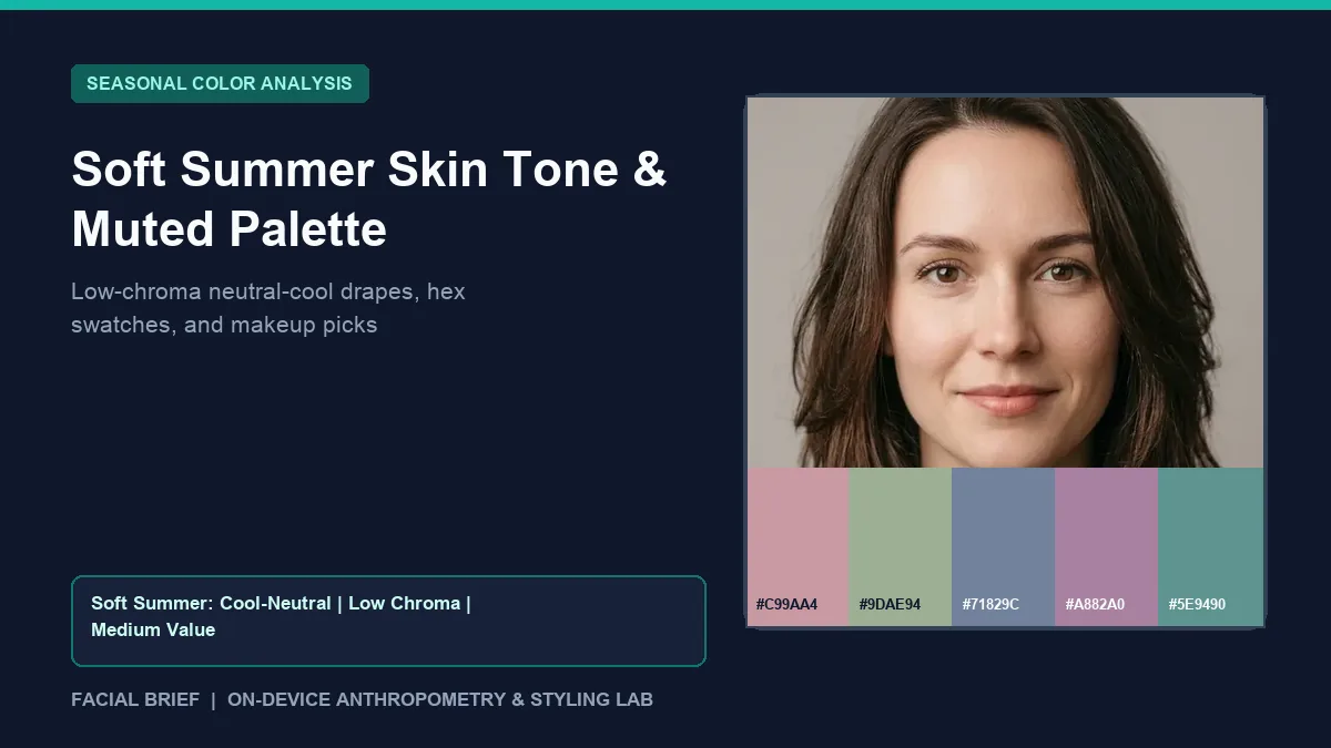
A soft summer skin tone sits at the muted, neutral-cool crossroads of the 12-season color system, where low pigment saturation matters more than extreme coldness or high contrast. In colorimetry terms, Soft Summer skin shows subtle pink, blue-gray, or neutral-olive undertones paired with medium lightness and a narrow luminance gap between hair, brows, eyes, and complexion. On color analysis communities like Reddit's r/coloranalysis, people in this band often feel confused because bright cool jewel tones and fiery autumn oranges both look wrong near their chin. Bright colors sit in front of the face instead of blending with it, while pure black casts gray shadows beneath the eyes. You can measure cheek warmth, skin depth, and hair contrast from a daylight selfie before shopping if you Run Color Analysis Free directly in your browser.
Key Takeaways
- Low chroma defines a soft summer skin tone, so shades softened with gray, taupe, or dusty rose harmonize while neon and primary colors overpower facial skin.
- In Facial Brief pixel sampling, Soft Summer profiles pair cool-to-neutral warmth (
meanR - meanBunder48) with medium luminance (120 to 188on a 0 to 255 scale) and low-to-medium hair contrast (< 95luminance delta). - Core power shades center on dusty rose (
#C99AA4), muted sage (#9DAE94), slate blue (#71829C), smoky mauve (#A882A0), and dusty teal (#5E9490). - Soft charcoal-navy (
#3C4352), cool dove gray (#C5BEC2), and soft alabaster (#EAE7E4) outperform pitch jet black (#111111) and optical white for daily staples. - Neutral-olive Soft Summers frequently struggle with pink-heavy or peach-heavy foundations, making neutral bases mixed with a drop of blue color corrector a common fix.
Colorimetry Mechanics of a Soft Summer Skin Tone
Personal color systems sort complexions across three Munsell axes: hue (warm versus cool temperature), value (lightness versus darkness), and chroma (clarity versus muted gray softness). Most readers assume temperature decides everything, yet Soft Summer and Soft Autumn are led by chroma first. Every shade in a summer mute color palette carries a faint veil of gray or brown, softening blue, green, rose, and plum so fabric echoes low-contrast skin and eye tone.
Natural hair in this band leans toward ash blonde, mousy brown, cool mushroom brown, or weathered charcoal without brassy sheen. Eyes sit in soft blue-gray, muted hazel, gray-green, or slate brown. When Facial Brief samples cheek pixels, Soft Summer reads cool-leaning neutral (warmth < 28 classic cool, or 28 to 48 neutral-olive) with medium skin depth (120 to 188) and low-to-medium contrast (< 95).
One frequent snag in r/coloranalysis discussions on typing everyone Soft Summer comes from indoor selfies. Automatic white balance cools golden skin under indoor LEDs, making clear Spring or Autumn faces look muted on screen. Draping real cloth beside a north-facing window between 10:00 AM and 2:00 PM remains the cleanest test. If your skin suits clear brightness better than smoky grays, check our light spring color palette guide.
Neutral Soft Summer Color Palette vs. Neighboring Seasons
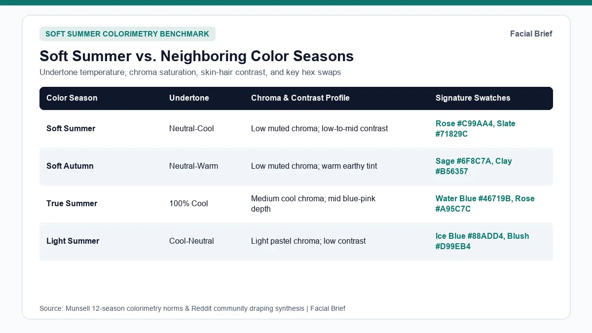
Border zones around a neutral soft summer color palette generate most mis-typing online. People hesitate between Soft Summer and Soft Autumn because both share muted grayness, or confuse Soft Summer with True Summer and Light Summer when looking at cool pastels. The table below compares Soft Summer against its closest 12-season neighbors and brighter counterparts.
| Season | Undertone & Temperature | Chroma & Contrast Rule | Core Swatches & Hex Codes | Metals & Colors to Avoid |
|---|---|---|---|---|
| Soft Summer | Cool-leaning neutral | Low muted chroma; low-to-mid contrast | Dusty rose #C99AA4, Sage #9DAE94, Slate #71829C, Mauve #A882A0, Teal #5E9490 | Brushed silver, pewter; avoid neon orange #FF6B00 and black #111111 |
| Soft Autumn | Warm-leaning neutral | Low muted chroma; earthy low contrast | Warm sage #6F8C7A, Clay #B56357, Oatmeal #E8E0D5, Taupe #8B7765 | Brushed bronze, brass; avoid icy magenta and stark white |
| True Summer | 100% Cool (blue base) | Medium cool chroma; balanced contrast | Water blue #46719B, Cool rose #A95C7C, Sea teal #548C84 | Sterling silver, platinum; avoid brassy gold and rust |
| Light Summer | Cool-neutral | Light airy chroma; low light contrast | Sky blue #88ADD4, Pastel rose #D99EB4, Mist #9EA5B3 | Light silver, white gold; avoid dark brown and jet black |
| Light Spring | Warm-neutral | Clear light chroma; low delicate contrast | Peach #F08C75, Mint #76B888, Butter #F2B84B | Champagne gold, rose gold; avoid dark charcoal and plum |
| True Autumn | 100% Warm (golden Y-YR) | Medium-muted warmth; mid-deep depth | Terracotta #B94E2C, Ochre #D08C28, Olive #4E6E48 | Yellow gold, copper; avoid icy gray and cool pastel pink |
Soft Summer vs. Soft Autumn and Olive Skin
Separating Soft Summer from Soft Autumn is the busiest debate across r/coloranalysis threads on knowing if you are Soft Summer, while Muted Summer draping threads show how closely 16-season Muted Summer hugs the neutral line. Testing extreme orange or hot pink rarely helps because neither muted season tolerates high saturation.
Instead, test muted mid-tones in daylight: hold dusty rose (#C99AA4) or soft plum (#8F6F8A) beneath your chin against warm terracotta (#B56357) or mustard. On Soft Summers, dusty rose clears under-eye shadows while terracotta turns the jawline muddy. As r/coloranalysis olive skin discussions note, neutral olives often lean Soft Summer in winter and borrow muted sage after summer sun exposure. Map warmth shifts inside Facial Brief's 42-Metric Full Report or compare warm tones in our true autumn color palette guide.
Separating Soft Summer from True Summer and Spring
Between Soft Summer and True Summer, saturation decides faster than hue. Compare True Summer water blue (#46719B) beside slate blue (#71829C); if clear blue pulls focus to your collar before your face, you need Soft Summer grayness. Our true spring color palette and bright spring color palette rely on sunlit pigments with zero gray softening, which highlight redness on muted skin.
Building a Practical Soft Summer Wardrobe
One candid complaint on Reddit shows up in threads where newly typed Soft Summers dislike their palette. Fans filled with dusty mauve, taupe, and faded slate feel subdued next to crisp Winter jewel tones. Most people warm up to the palette once they notice how evenly bare skin reads in muted shades and how varied fabric textures add depth.
Neutrals, Power Shades, and Replacing Stark Black
Pure jet black (#111111) and optical paper white exceed Soft Summer contrast, casting under-eye shadows or washing out medium-muted skin. Four straightforward swaps rebuild daily outfits quickly:
- Trade jet black tops for soft charcoal-navy (
#3C4352), pewter (#5C606E), or mushroom taupe (#756A6F), keeping black below the waist on trousers and shoes. - Replace stark white shirts with soft alabaster (
#EAE7E4), pale oyster, or cool dove gray (#C5BEC2). - Build outfits around power hues: dusty rose (
#C99AA4), sage green (#9DAE94), slate blue (#71829C), smoky mauve (#A882A0), dusty teal (#5E9490), and periwinkle (#7D79A1). - Keep neon orange (
#FF6B00), brassy gold (#D4AF00), and harsh rust (#8C3D00) away from the collar.
Texture keeps muted clothes from reading flat. Matte gray cotton tees look washed out, while ribbed cashmere, brushed wool, washed linen, suede, and matte silk catch soft light. Dressing in tonal columns, like pairing dove gray knitwear with charcoal-navy trousers, adds structure without harsh contrast.
Jewelry Metals, Eyewear, and Hair Color
Bright chrome and shiny yellow gold look detached against Soft Summer skin. Brushed sterling silver, satin pewter, oxidized silver, and matte white gold merge cleanly with cool-neutral undertones, while brushed rose gold or soft champagne bridges the Soft Autumn edge.
For glasses, warm amber tortoiseshell looks heavy, so opt for translucent smoke gray, brushed gunmetal, rose-taupe acetate, or matte navy frames. In hair color, staying within two levels of natural depth preserves low contrast; ash brown, mushroom blonde, and cool brunette glosses avoid brassy orange fade. Preview cool ash shades on your portrait with Facial Brief's Hair Color Try-On or review full metrics on our sample facial report.
Makeup Strategy for Cool-Neutral and Olive Soft Summers
Drugstore and prestige cosmetic counters skew heavily toward pink-cool or peach-warm formulas. On r/OliveMUA Soft Summer makeup threads, users flag two recurring mismatches: cool pink foundations turn chalky, while neutral bases often oxidize orange. Mixing a tiny drop of blue color corrector into a medium-neutral foundation cancels excess orange-yellow warmth without creating a gray cast.
Lip and cheek formulas harmonize best when muted with taupe, brown, or dusty plum rather than clear berry or warm terracotta. Community picks repeatedly favor dusty rose, mauve-brown, and soft plum stains (such as MAC Whirl, Blushbaby, and Breath of Plum, or sheer neutral-rose balms). Swap orange bronzers for cool taupe-gray contour powders that mirror natural shadow, and trade wet black liner for charcoal-brown, espresso, or slate-plum mascara to match softer iris contrast.
Frequently Asked Questions
What colors make a soft summer skin tone look washed out?
Stark jet black (#111111), pure optic white, neon orange (#FF6B00), brassy yellow (#D4AF00), and heavy rust (#8C3D00) clash most noticeably with a soft summer skin tone. High-contrast black and white cast dark shadows beneath the eyes and pull focus away from subtle facial coloring, while bright warm oranges collide with cool-neutral undertones and leave skin looking tired or unevenly flushed.
Can you be a Soft Summer with brown eyes or olive skin?
Yes. Eye color alone never excludes Soft Summer, and many Soft Summers have soft hazel, muted gray-brown, or cool light brown eyes instead of blue. Neutral-olive skin frequently belongs in Soft Summer because olive complexions carry cool blue-gray pigment underneath muted surface warmth. Low-chroma dusty rose, slate blue, and dusty teal often clear green-gray shadows better than rich autumn earth tones.
Should a Soft Summer wear gold or silver jewelry?
Brushed sterling silver, satin pewter, white gold, and softly oxidized silver harmonize best with Soft Summer undertones because their muted sheen mirrors low-contrast coloring. Shiny mirror-finish yellow gold usually stands apart from cool-neutral skin. If your undertones sit right on the Soft Autumn border, matte rose gold or soft champagne metals also blend comfortably when kept subtle near the face.
What is the fastest home test for Soft Summer vs. Soft Autumn?
Stand beside a north-facing window in natural daylight with bare skin and hair pulled back, then alternate two muted mid-tone fabrics beneath your chin: dusty mauve or slate blue (#71829C) against warm terracotta or golden mustard. If dusty mauve evens out surface redness and brightens your eyes while terracotta throws an orange cast along your jaw, your palette centers in Soft Summer.
Referenced Community Discussions & Sources
- r/coloranalysis: Signs that confirm you are a Soft Summer: Breaks down low-chroma dominance, washed-out reactions to stark white or black, and brushed metal compatibility.
- r/coloranalysis: Why so many neutral and muted types get placed in Soft Summer: Examines over-typing pitfalls and how indoor lighting shifts apparent saturation on smartphone cameras.
- r/coloranalysis: Understanding Muted Summer versus 12-season Soft Summer: Explains how 16-season Muted Summer bridges Soft Summer and Soft Autumn along neutral skin borders.
- r/coloranalysis: Navigating initial disappointment with the Soft Summer palette: Notes practical fabric textures and tonal dressing choices that keep low-contrast outfits lively.
- r/OliveMUA: Makeup, blue foundation mixers, and dusty rose picks for Soft Summers: Details real user fixes for peach foundation mismatches, taupe contour shades, and mauve lip formulas.
- r/coloranalysis: How olive undertones straddle Soft Summer and Soft Autumn: Discusses neutral-olive chroma dominance and seasonal tan shifts across winter and summer drapes.
- Munsell Color-Order System (ASTM D1535): Quantitative hue, value, and chroma specification underlying 12-season personal color analysis.
Paired Facial Brief Analyzer
Measure your own proportions on-device
Run private 478-point landmark geometry in your browser with zero server photo upload on free tools.
Continue Reading