Deep Autumn Colors: Palette Swatches, Skin Tones, and Fit
Master deep autumn colors with hex swatches, olive skin bridges, lipsticks, metals, and a 6-season table comparing deep autumn against deep winter.
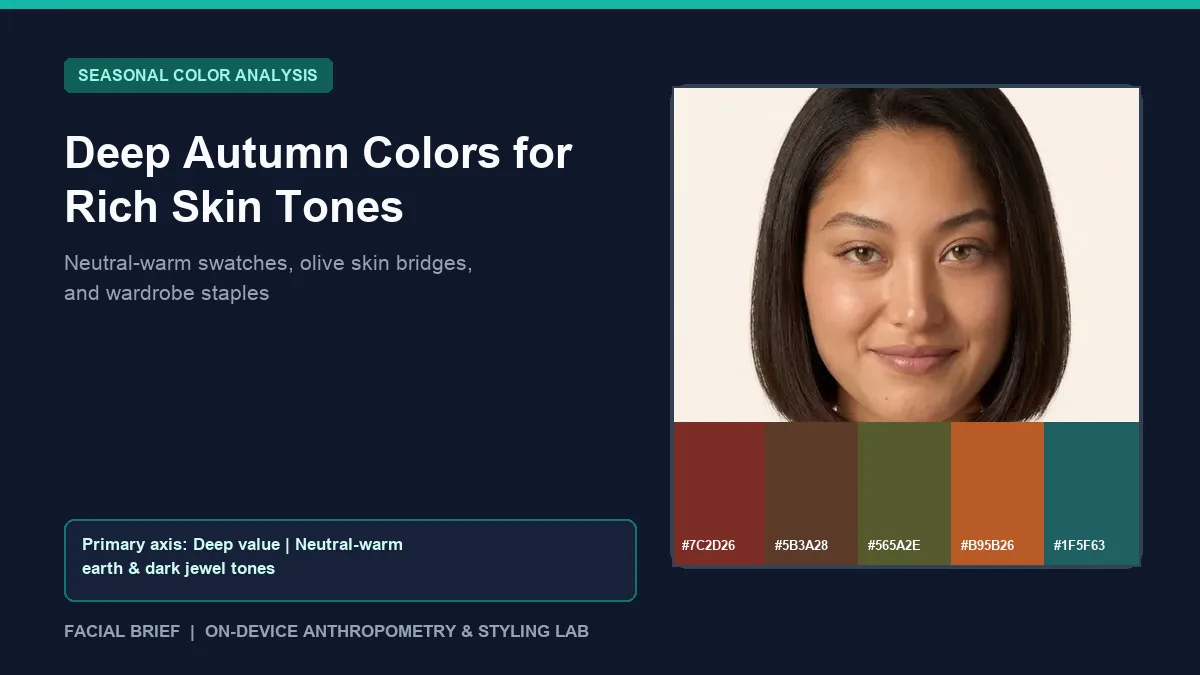
Knowing you need dark clothes without looking harsh in pure black points straight toward deep autumn colors. Positioned on the border where Autumn meets Winter, this sub-season puts visual weight and shadow depth first, paired with neutral-warm saturation rather than golden lightness. On r/coloranalysis and r/autumns, users typed into this palette often feel relieved when bright neon orange looks terrible on them, yet stay unsure whether dark navy, espresso brown, or silver belongs near their face. Testing facial skin luminance, undertone bias, and contrast in daylight removes the guesswork before buying another coat: Run Color Analysis Free directly in your browser to inspect your temperature and value profile.
Key Takeaways
- Deep autumn colors prioritize dark value first and warmth second, giving neutral-warm skin enough pigment weight without sliding into dusty softness or icy Winter coldness.
- Core anchor swatches include mahogany (
#7C2D26), espresso chocolate (#5B3A28), olive moss (#565A2E), burnt terracotta (#B95B26), and deep teal (#1F5F63), supported by warm ivory (#EFE8D6) and pine (#264736). - Colors for deep autumn skin tone span fair-to-deep complexions, including "fair dark autumns" and neutral-olive users who look sallow in neon yellow-orange yet glow in deep teal, brick red, and dark navy.
- Stark jet black and optical white sit too cold and high-contrast against subtle warmth; swapping to espresso, mahogany, and warm ivory preserves depth without casting gray shadows under the eyes.
- Soft 10k or 14k antique gold, bronze, and copper blend seamlessly with warm-leaning skin, while neutral-olive Deep Autumns often wear brushed or oxidized silver comfortably.
Value depth and temperature in deep autumn colors
In 12-season colorimetry built around Munsell hue, value, and chroma axes, deep autumn colors (frequently called Dark Autumn in 16-season frameworks) hold the darkest value inside the Autumn family. Unlike True Autumn, where golden yellow-red warmth dominates every swatch, Deep Autumn leans neutral-warm because it shares a boundary with Deep Winter. That neutral tilt widens what works near your face while sharply narrowing what washes you out.
Pale chalky pastels, icy mint (#C8EBE0), powder blue (#B8D2E8), and dusty light gray drain high-contrast facial features right away because they lack pigment density. Meanwhile, neon tangerine and bright yellow-orange sit slightly too loud and overly yellow for neutral-warm undertones. Pigments that harmonize best carry heavy saturation anchored with a drop of brown or black: deep pine (#264736), aubergine (#4D2C3D), tomato red (#B43728), burnt sienna (#8B452F), dark chocolate (#3D261D), and dark teal (#1F5F63). On Facial Brief's in-browser analyzer, Deep Autumn matches typically emerge when warm-to-neutral cheek readings (red-minus-blue balanced above cool thresholds) pair with dark hair, deep brows, or deeper skin luminance (skin luminance < 120 on a 0 to 255 scale).
Deep autumn examples across fair, olive, and deep skin tones
A widespread misconception treats deep autumn colours as exclusive to medium or tanned complexions. Across this r/coloranalysis fair Deep Autumn thread and this r/autumns discussion of atypical Deep Autumns, users point to two common overlooked profiles:
- Fair high-contrast Deep Autumns: Pale neutral-warm skin with espresso hair and dark brown eyes often gets misread as Deep Winter. Draping pure white against warm ivory (
#EFE8D6) usually settles it: stark white looks clinical, while cream softens jawline shadows. - Olive undertones in the Winter-Autumn bridge: Contributors on this r/coloranalysis olive Deep Autumn thread note that green-gray overtones turn bright mustard sallow, whereas dark teal, pine, aubergine, and dark navy keep contrast crisp.
- Deep and medium-warm complexions: Dark melanin with warm golden or mahogany undertones looks clear in tomato red, warm espresso, bronze, and antique gold (
#B78A3E), whereas icy lavender or chalky white looks flat.
For visual reference, deep autumn examples discussed online (as unverified community typings rather than studio drapes) include Natalie Portman, Oscar Isaac, Eva Mendes, and Jessica Alba, each pairing deep hair-to-eye contrast with neutral-warm skin.
Why bright pumpkin orange fails many deep autumns
If you open an autumn deep color palette expecting cheerful pumpkin sweaters and light camel coats, you may hit an immediate wall. Many commenters in this r/coloranalysis thread on struggling to love Dark Autumn confess they doubted their typing because bright orange and yellowish mustard looked jarring.
The fix comes from honoring depth over pure warmth. True Autumn thrives in medium spice tones and warm camel, whereas Deep Autumn needs heavy saturated warmth: swap bright orange for deep rust, burnt sienna (#8B452F), or brick mahogany (#7C2D26), and trade yellow-heavy ochre for dark mossy olive (#565A2E) or deep teal. If your wardrobe lights up in vivid medium rusts and golden amber without needing charcoal weight, check our True Autumn breakdown or explore lighter sunny palettes in our true spring color palette guide.
Deep autumn vs. bordering palettes comparison
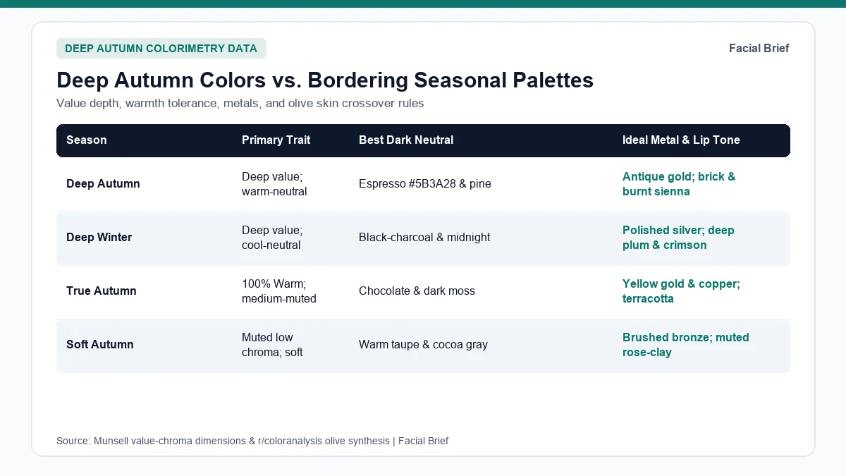
Because colors for deep autumn skin tone sit right next to Deep Winter and True Autumn, testing boundary drapes side by side prevents costly wardrobe mistakes. Use the six-season comparison table below to check neutral anchors, metal rules, and lip shades.
| Season | Primary Trait | Temperature Axis | Best Dark & Light Neutrals | Signature Accent Swatches | Metal & Lip Rule |
|---|---|---|---|---|---|
| Deep Autumn | Dark value first | Neutral-warm (Autumn-Winter edge) | Espresso #5B3A28, Pine #264736, Warm ivory #EFE8D6 | Mahogany #7C2D26, Terracotta #B95B26, Deep teal #1F5F63 | 10k/14k antique gold, bronze; brick red & burnt sienna lips |
| Deep Winter | Dark value first | Neutral-cool (Winter-Autumn edge) | Black-charcoal, Midnight navy, Crisp optic white | Ruby #9E1F34, Deep emerald #165C47, Plum #5D2247 | Polished silver, pewter; deep crimson & cool plum lips |
| True Autumn | Warmth first | 100% Warm golden yellow base | Dark chocolate, Olive moss, Warm cream #E2D2B5 | Rust #B94E2C, Ochre mustard #D08C28, Warm teal #28666E | Yellow gold, hammered copper; terracotta & cinnamon lips |
| Soft Autumn | Muted chroma first | Warm-neutral (flows toward Summer) | Cocoa taupe #8B7765, Soft oatmeal, Warm pewter | Sage #6F8C7A, Clay rose #B56357, Muted olive | Brushed antique brass; soft rose-clay & muted peach lips |
| Soft Summer | Muted chroma first | Cool-neutral (dusty rose-slate) | Soft navy #3A4B63, Stone cream, Cocoa gray | Dusty rose #C58F98, Slate blue #6F839C, Mauve #9E8494 | Brushed sterling silver; cool mauve & rosewood lips |
| True Spring | Warm brightness | 100% Warm clear yellow base | Warm camel, Cream ivory, Light golden cocoa | Clear coral #E06449, Grass green #4F9A69, Marigold #EB9E2E | Bright polished yellow gold; warm coral & poppy lips |
Still torn between Deep Autumn and Deep Winter? Read this r/coloranalysis Deep Winter vs. Deep Autumn breakdown, where users compare dark chocolate brown against jet black in north-facing daylight: chocolate makes Deep Autumn skin look clear while flattening cool Winters. If muted medium colors feel calmer than heavy darks, inspect our soft summer color palette guide and light spring color palette guide, or check a sample facial report and the 42-Metric Full Report.
Hot-weather swaps, metals, and deep autumn lipsticks
Translating a heavy deep autumn color closet into summer clothes, metals, and cosmetics means keeping dark-light contrast intact without winter wool weight.
Building warm-weather outfits with warm ivory and dark navy
Users avoiding heavy dark burgundy in July heat on r/coloranalysis and r/OliveMUA rely on two bridge neutrals. First, trade cold optical white (#FFFFFF) for warm ivory (#EFE8D6) or oyster linen so summer shirts brighten the jawline softly. Second, anchor outfits with saturated dark navy shorts or trousers borrowed from the Deep Winter overlap, paired with soft teal, peach-nude, or muted lime-olive tops and a bronze belt.
The gold vs. oxidized silver metal debate and lipsticks
In this r/coloranalysis thread on Deep Autumns disliking bright gold, neutral-olive wearers point out that blinding 24k yellow gold looks overly brassy against green-neutral skin. Muted 10k or 14k brushed gold, burnished bronze, copper, and oxidized silver set with garnet or amber harmonize cleanly. On lips, this r/autumns lipstick favorites thread recommends MAC Chili, MAC Marrakesh, MAC Dubonnet, and NARS Pigalle alongside dark brown mascara and terracotta blush, while Revlon Rum Raisin splits opinions between neutral-cool and golden-warm undertones.
Frequently Asked Questions
Can a Deep Autumn wear black or navy?
Pure jet black near the bare neck often looks slightly too stark and cool, casting subtle shadows beneath the chin on warm-leaning skin. However, deep saturated navy sits well inside the Deep Autumn crossover with Deep Winter, making it an ideal dark basic alongside espresso (#5B3A28) and deep pine (#264736). If you wear black tops, add a warm gold necklace or burnt terracotta scarf near your collarbone.
How do I tell if I am Deep Autumn or Deep Winter?
Drape pure chocolate brown (#3D261D) against charcoal jet black, and warm ivory (#EFE8D6) against bright optical white (#FFFFFF) in indirect north-facing daylight with clean, makeup-free skin. Deep Autumn complexions look smoother, calmer, and noticeably better rested beside dark chocolate and warm cream, while Deep Winter complexions sharpen cleanly against cool black-charcoal and optic white without turning sallow along the jawline.
Why do bright orange and mustard look bad on my Deep Autumn skin?
While standard charts push loud orange and mustard onto every Autumn, Deep Autumn prioritizes dark value over golden brightness, particularly on fair or neutral-olive complexions. Bright neon pumpkin and yellow-heavy mustard overpower neutral undertones quickly in daylight. Shifting toward darker burnt sienna (#8B452F), brick mahogany (#7C2D26), deep teal (#1F5F63), and dark olive moss delivers depth without sallow yellow skin reflection.
What jewelry metals look best with deep autumn colors?
Soft brushed 10k or 14k yellow gold, antique brass, burnished bronze, and warm copper are the safest everyday metal choices because they echo warm earth depth without mirror-like bright glare. Neutral-olive Deep Autumns who dislike shiny yellow gold often wear oxidized, darkened, or antiqued sterling silver effortlessly, especially when paired with warm-toned natural gemstones like garnet, smoky quartz, or deep amber.
Referenced Community Discussions & Sources
- r/coloranalysis: Deciding between Deep Winter and Deep Autumn drapes: Compares chocolate brown vs. charcoal black and warm cream vs. optic white along the dark neutral border.
- r/coloranalysis: Fair and pale complexions typed as Deep Autumn: Explains why high-contrast pale skin with dark espresso hair frequently belongs in Deep Autumn rather than Winter.
- r/coloranalysis: Navigating olive skin tone overlap in Deep Autumn: Examines why bright warm yellow-oranges clash with olive overtones while deep teal, pine, and dark navy bridge seamlessly.
- r/coloranalysis: Overcoming disappointment with bright orange in Dark Autumn palettes: Highlights replacing loud pumpkin shades with burnt sienna, burgundy, and deep olive staples.
- r/coloranalysis: Gold vs. antiqued silver preferences for Deep Autumns: Discusses why soft lower-karat gold, bronze, and oxidized silver outperform shiny yellow 24k gold on neutral-leaning complexions.
- r/autumns: Community-tested lipstick favorites for Deep Autumn undertones: Lists brick red, burnt orange-brown, and amplified wine shades including MAC Chili, Marrakesh, and Dubonnet.
- Colorimetry Reference: Munsell Color-Order System (ASTM D1535) value, hue, and chroma coordinates used in 12-season draping frameworks.
Paired Facial Brief Analyzer
Measure your own proportions on-device
Run private 478-point landmark geometry in your browser with zero server photo upload on free tools.
Continue Reading