True Spring Color Palette: Warm Shades, Swatches & Fit
Explore the true spring color palette with Munsell hue bounds, hex swatches, makeup picks, and a 6-season comparison table for warm clothes.
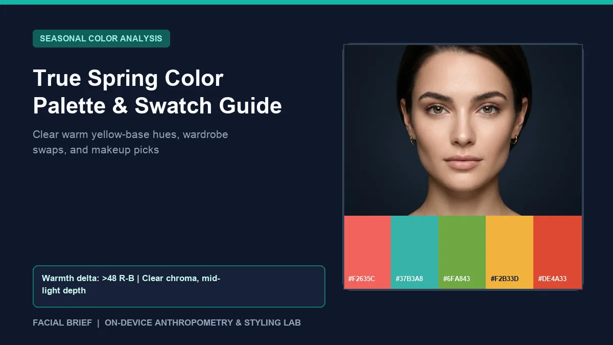
The true spring color palette sits at the warm core of the 12-season colorimetry framework, defined first by a golden-yellow undertone and second by clear, sunlit saturation. Across r/SpringColorAnalysis and r/coloranalysis, newly typed True Springs run into two recurring surprises. Mainstream clothing racks lean heavily toward optic white, jet black, and dusty cool neutrals, making warm staples hard to source off season. At the same time, readers with brunette hair or brown eyes often assume they belong in Autumn until live fabric draping shows how muddy rust dulls their skin while clear coral clears under-eye shadows. To check your cheek warmth, luminance depth, and contrast spread from an indirect-daylight photo before shopping, Run Color Analysis Free in your browser.
Key Takeaways
- True Spring sits in the warm Yellow (
Y) and Yellow-Red (YR) Munsell hue family, combining golden temperature with clear medium-to-high chroma and medium-light value. - Core power swatches center on coral red (
#F2635C), warm turquoise (#37B3A8), leaf green (#6FA843), marigold (#F2B33D), and poppy red (#DE4A33), anchored by cream ivory (#F6EED9) and warm camel (#D6BE96). - Pixel sampling places warm profiles above a
48red-minus-blue threshold alongside light-to-medium skin luminance (120 to 215on a 0 to 255 scale) and moderate hair contrast (48 to 95delta). - Stark jet black (
#0F111A) and optic white (#FFFFFF) cast cool gray shadows under warm jawlines, making warm navy, cocoa (#594832), and cream ivory cleaner collar neutrals. - Bright polished yellow gold, rose gold, and warm coral or peach lip formulas beat blue-based pinks that turn flat on golden skin.
Colorimetry and Munsell Structure of True Spring Colors
Seasonal color systems evaluate skin, hair, and eye harmony across three axes from the Munsell color-order specification: hue (temperature), value (lightness to darkness), and chroma (purity versus gray muting). In 16-season frameworks, True Spring is called Warm Spring because temperature drives the entire palette. True spring colors cluster in the golden Y, YR, and yellow-shifted GY bands, so greens carry warm yellow like fresh grass (#6FA843) and blues shift toward turquoise (#37B3A8) or golden teal (#2D9299).
When Facial Brief samples bare cheek and forehead regions, warm profiles separate cleanly where average red channel readings exceed blue by more than 48 points (meanR - meanB > 48). Skin depth usually lands in the light-to-medium luminance band (120 to 215 via Rec. 709 0.2126R + 0.7152G + 0.0722B), and the luminance gap between hair and skin measures roughly 48 to 95. That moderate contrast explains why medium saturation flatters without requiring sharp black-and-white contrast.
One persistent stereotype unpacked in r/SpringColorAnalysis discussions on Carol Brailey True Spring typings is that Springs must have blonde hair and blue eyes. Medium-dark brunettes and people with hazel or brown eyes often misread themselves as Autumns until daylight drapes prove earthy terracotta dulls their jawline while poppy red restores healthy brightness.
Indoor lighting distorts these cues easily. Phone white balance cools golden skin under indoor LEDs and turns muted greens gray. Checking fabric beside a north-facing window between 10:00 AM and 2:00 PM avoids false reads before spending $100 to $300 on an in-person studio ($75 to $150 online), and comparing bright spring color palette swatches helps gauge saturation limits.
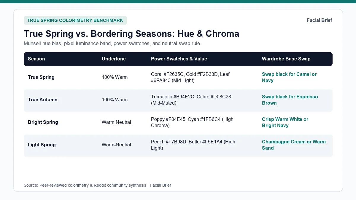
True Spring Color Palette vs. Bordering Seasons
Mistyping happens most along warmth and saturation borders, especially between True Spring and True Autumn or Bright Spring. The table below maps the true spring color palette against its closest warm neighbors and cool summer benchmarks.
| Season | Undertone & Hue Bias | Chroma & Value | Core Swatches & Hex Codes | Wardrobe Base & Metal |
|---|---|---|---|---|
| True Spring | 100% Warm (Y to YR) | Clear medium-high; light-to-mid | Coral #F2635C, Turquoise #37B3A8, Leaf #6FA843, Marigold #F2B33D | Yellow gold, rose gold; swap black for camel or warm navy |
| True Autumn | 100% Warm (Y to YR) | Medium-muted; mid-to-deep | Terracotta #B94E2C, Ochre #D08C28, Olive #4E6E48, Teal #28666E | Yellow gold, copper; swap black for espresso brown |
| Bright Spring | Warm-neutral | Very high clear; medium depth | Poppy #F04E45, Cyan #1FB6C4, Lime #7CB53A, Pink #E1418D | Bright gold; swap camel for bright navy and warm white |
| Light Spring | Warm-neutral | Gentle clear; very light | Peach #F7B98D, Mint #9FD8CB, Butter #F5E1A4, Coral #F2887E | Champagne gold; swap dark gray for warm sand |
| Light Summer | Cool-neutral | Light delicate; very light | Sky #A9C6E8, Blush #DCA0AC, Lavender #BBA8D8, Mint #A5D8C3 | Light silver, white gold; swap black for soft charcoal |
| True Summer | 100% Cool (blue base) | Medium cool; mid-light | Cornflower #6584BA, Raspberry #B65479, Teal slate #4D7E8A | Sterling silver, platinum; swap camel for cool navy |
Separating True Spring from True Autumn
The most active border thread on r/SpringColorAnalysis True Spring vs. True Autumn discussions involves warm-toned shoppers torn between bright corals and earthy spices. Gold flatters both groups, so clarity settles the tie. Hold clear coral (#F2635C) or daffodil yellow (#F2B33D) beneath your chin opposite terracotta (#B94E2C) or ochre (#D08C28). True Springs look rested in clear coral, while earthy rust shadows the lower cheeks; True Autumns see bright coral pull focus away from skin.
A tied pitfall appears in r/SpringColorAnalysis threads on mismatched True Spring palettes, where printed fans mix muddy autumn mustard into Spring cards, turning warm complexions sallow. Compare earth pigments in our true autumn color palette guide or inspect contrast gaps in the 42-Metric Full Report.
Separating True Spring from Bright Spring and Light Spring
Sub-season boundaries within Spring turn on saturation ceiling and lightness. Bright Spring borders Winter with high contrast (lumDelta > 95) and handles cyan (#1FB6C4) and hot magenta (#E1418D), hues that overpower medium-contrast True Springs. Light Spring sits above 188 skin luminance with low contrast (lumDelta < 48), favoring buttercream and pale peach (#F7B98D) where medium True Spring greens feel heavy. For cooler high-lightness rules, see our light summer color palette guide.
Building a True Spring Wardrobe Palette and Makeup Routine
Turning swatches into wearable outfits takes patience because off-season retail shelves lean cool and muted. Shoppers on r/coloranalysis True Spring clothing sourcing threads note that even standard khaki, beige, and heather gray carry gray-blue undertones that dull warm skin. Keeping a five-hex reference image on your phone while shopping online, or checking season-indexed lines like Kettlewell Colours during spring releases, builds a reliable true spring wardrobe palette without trial-and-error returns.
Neutrals, Black Swaps, and Hair Framing
Letting go of black tops and optic white shirts is the hardest wardrobe adjustment for new True Springs. Across r/SpringColorAnalysis neutral comparison threads, members replace stark black (#0F111A) and cool slate (#7B8294) near the collar with four warm anchors:
- Trade optic white tees for warm cream ivory (
#F6EED9), vanilla, or light champagne cotton. - Swap jet black tops for warm camel (
#D6BE96), golden tan (#8C7252), warm cocoa (#594832), or bright warm navy, keeping existing black trousers and shoes below the waist. - Use warm leaf-moss (
#4E664B) or golden teal (#2D9299) for blazers and knitwear where cool charcoal feels heavy. - Keep one clear warm accent near the chin, like coral (
#F2635C) or turquoise (#37B3A8), whenever wearing darker brown bottoms.
Natural True Spring hair includes golden blonde, strawberry blonde, copper, and warm honey chestnut. Cool ash toners, icy silver blondes, and blue-black dyes fight yellow undertones and leave skin looking dull. Previewing honey or warm auburn glosses on your photo with Facial Brief's Hair Color Try-On keeps depth harmonious before booking a colorist.
True Spring Makeup Colors, Metals, and Frames
Cosmetic counters routinely push blue-red lipsticks, cool mauve nudes, and taupe contours that turn chalky on golden skin. Across r/SpringColorAnalysis Warm Spring blush threads and r/SpringColorAnalysis Warm Spring makeup discussions, users favor juicy peach and warm coral formulas for true spring makeup colors.
Community cheek staples include Clinique Cheek Pop in Melon Pop and Ginger Pop, NARS Torrid (warm coral) and Sex Appeal (soft peach), Glossier Cloud Paint in Beam, and budget Essence Peach Please. On the lips, sheer-to-medium coral, poppy pink, and rosy warm terracotta tones win steady praise: Charlotte Tilbury Stoned Rose, Clinique Pop Melon Pop, MAC See Sheer and Peach Blossom, Tom Ford Spanish Pink, and warm peach-pink shades from Maybelline Vinyl Ink brighten skin cleanly without feeling heavy.
Around the eyes, swap jet-black liquid liner for dark chocolate brown, warm bronze, and golden champagne shimmers like Charlotte Tilbury Eyes to Mesmerize in Rose Gold, Hourglass Solstice, or MAC All That Glitters and Woodwinked. Pair warm polished yellow gold, rose gold, citrine, and warm tortoiseshell glasses with your palette. You can inspect how seasonal swatches pair with facial landmarks inside our sample facial report.
Frequently Asked Questions
Can a True Spring have dark brown hair or dark eyes?
Yes. Natural hair and iris depth alone never exclude True Spring, and many brunettes with warm golden skin sit squarely in this season. Color analysts evaluate how fabric reflects onto facial skin under natural indirect daylight and ignore hair-color stereotypes. When dark-haired True Springs drape clear coral (#F2635C) or poppy red (#DE4A33) against muted rust, under-eye shadows fade and eye whites sharpen without appearing overwhelmed.
What are the best neutrals in the true spring color palette?
Warm ivory (#F6EED9), vanilla cream, light camel (#D6BE96), golden tan (#8C7252), warm cocoa (#594832), bright warm navy, and warm leaf-moss (#4E664B) form the cleanest neutral base. These shades preserve golden warmth without throwing the cool gray shadows caused by stark jet black (#0F111A), cool heather gray, or optical white. Wearing ivory or camel near the collar while keeping darker warm browns on trousers keeps outfits balanced.
How can I tell if a yellow or green fits true spring colors?
Check whether the pigment looks sunlit and clear versus browned or dusty. True Spring yellows resemble warm daffodil, buttercup, or marigold (#F2B33D), whereas muddy ochre, greenish chartreuse, and antique mustard belong in True Autumn. In greens, choose fresh spring leaf (#6FA843), apple green, or warm turquoise (#37B3A8) tinted with yellow instead of cool pine, dusty sage, or drab olive. Clear, freshly sprouted tones belong in True Spring.
Which makeup and jewelry finishes clash with True Spring skin?
Blue-based ruby lipsticks, frosty lavender eyeshadows, cool mauve nudes, and wet jet-black eyeliner commonly look separated or chalky on golden True Spring skin. Heavy matte full-coverage foundations and cool gray-taupe contours also flatten natural cheek glow. In jewelry, icy platinum, bright chrome silver, and dark oxidized pewter stand out sharply against yellow undertones, whereas bright yellow gold, rose gold, and warm amber harmonize right away.
Referenced Community Discussions & Sources
- r/SpringColorAnalysis: Deciding between True Spring and True Autumn: Compares clear coral and sunny yellow clarity against earthy terracotta warmth.
- r/SpringColorAnalysis: Why mismatched yellow swatches confuse True Springs: Shows why dull mustard swatches clash while clear sun-warmed yellows lift skin tone.
- r/SpringColorAnalysis: Best neutral swaps for True Spring wardrobes: Compares cream ivory, camel, cocoa brown, and warm teal against black and white.
- r/SpringColorAnalysis: Carol Brailey True Spring typing with darker hair: Confirms brunettes test True Spring when daylight drapes favor warm clarity.
- r/coloranalysis: Practical shopping strategies for True Spring clothes: Covers retail scarcity of warm basics and phone swatch cards for filtering.
- r/SpringColorAnalysis: Community blush favorites for True and Warm Springs: Highlights warm coral and peach picks including Clinique Melon Pop, NARS Torrid, and Glossier Beam.
- r/SpringColorAnalysis: Warm Spring lipsticks and eyeshadow picks: Reviews luminous warm lip and metallic lid formulas without cool cast.
- Munsell Color-Order System (ASTM D1535): Standard specifying hue (
Y,YR,GY), value, and chroma axes in 12-season colorimetry.
Paired Facial Brief Analyzer
Measure your own proportions on-device
Run private 478-point landmark geometry in your browser with zero server photo upload on free tools.
Continue Reading