Light Summer Color Palette: Cool Pastels, Swatches & Fit
Decode the light summer color palette with skin luminance ranges, cool hex swatches, makeup picks, and a 6-season comparison table for clothes.
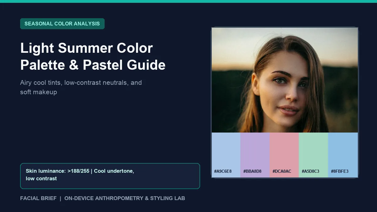
The light summer color palette sits at the delicate, high-lightness edge of the Summer family, led first by pale value and second by a cool-neutral undertone bordering Spring. On r/coloranalysis and r/SummerType, people discovering they are Light Summer run into two opposite traps. Some mourn losing everyday black turtlenecks and bright white tees, noticing too late how stark black drains life from a low-contrast face. Others buy muted greiges meant for Soft Summer and end up looking gray or washed out because they overlooked Light Summer's need for clean, watercolor clarity. To measure your skin luminance, cool undertone lean, and hair contrast from an indirect-daylight selfie before updating your closet, Run Color Analysis Free right in your browser.
Key Takeaways
- High value (lightness) leads the light summer color palette ahead of heavy muting, pairing delicate cool-neutral hues with low-to-medium feature contrast.
- Core swatches center on sky blue (
#A9C6E8), lavender mist (#BBA8D8), pastel blush rose (#DCA0AC), cool mint (#A5D8C3), and glacier blue (#8FBFE3). - Facial Brief pixel sampling assigns Light Summer where cool undertone (
meanR - meanB < 28) meets light skin luminance (> 188on a 0 to 255 scale) and low-to-medium hair contrast (< 95delta). - Stark jet black (
#141414), burnt orange (#BA5228), and dark espresso (#3F2B21) cast harsh under-eye shadows, while soft charcoal (#5C6470), light pewter (#B5BCC4), and soft ivory (#F5F3EE) frame features cleanly. - Cool ash mascara, translucent icy-rose blush, and sheer pink-berry lip tints match delicate contrast better than orange bronzer or opaque plum stains.
Colorimetry and Luminance Rules of Light Summer Colors
Within the Munsell color-order framework, light summer colors sit high on the value scale (light tints lightened with white) alongside cool blue-pink undertones and light-to-medium chroma. Unlike Soft Summer, which adds gray dust to mute pigment, Light Summer stays noticeably fresher and clearer because it borders Light Spring. Think of translucent watercolors or pale frosted glass.
In Facial Brief pixel sampling across bare cheek and forehead areas, Light Summer profiles register cool-to-neutral warmth (meanR - meanB < 28), high Rec. 709 skin luminance (> 188 on a 0 to 255 scale), and low-to-medium hair-to-skin luminance contrast (< 95, often dropping under 48 on fair blondes and light brunettes). Natural hair covers ash blonde, champagne blonde, and soft sandy brown paired with sky blue, gray-blue, cool hazel, or soft sea-green eyes.
Korean personal color studios popularized "Summer Light" palettes, leading newcomers on r/coloranalysis Light Summer typing threads to think the season means wearing baby blue nonstop. The fan spans soft navy, rosewood (#BD8896), periwinkle (#95A9D6), cool mint (#B6DFCE), soft raspberry, and light cocoa-taupe. Lighting swings self-tests easily: warm indoor bulbs turn fair cool skin golden on camera, pushing Light Summers into Spring quizzes. Draping cloth beside a north-facing window between 10:00 AM and 2:00 PM beats phone white balance before paying $100 to $300 for a studio ($75 to $150 online). Compare grayer cool tones in our soft summer color palette guide.
Light Summer vs. Light Spring, True Summer, and Soft Summer
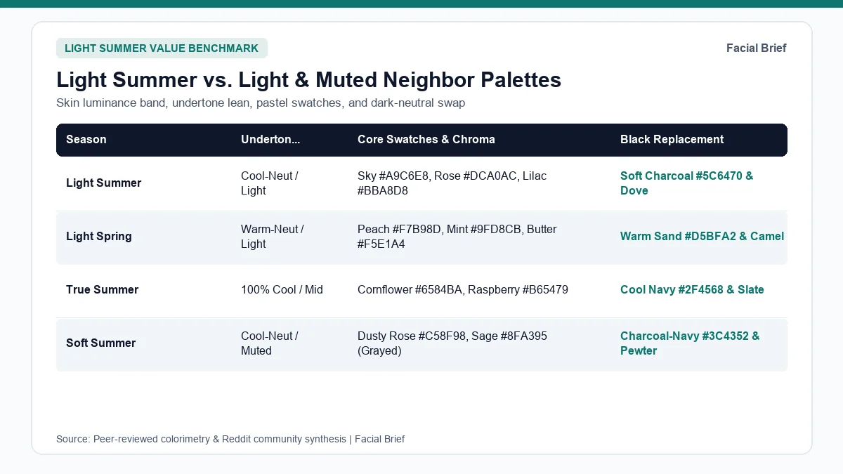
Mis-typing around Light Summer clusters along two splits: cool Light Summer versus warm Light Spring, and airy Light Summer versus heavier True or Soft Summer. The table below maps the light summer color palette alongside its closest light and cool neighbors.
| Season | Undertone & Temperature | Value & Chroma | Core Swatches & Hex Codes | Metals & Black Replacement |
|---|---|---|---|---|
| Light Summer | Cool-neutral (Spring border) | Very light (> 188 lum); delicate cool | Sky #A9C6E8, Lavender #BBA8D8, Blush #DCA0AC, Mint #A5D8C3 | Light silver, white gold; swap black for soft charcoal #5C6470 and dove |
| Light Spring | Warm-neutral (Summer border) | Very light (> 188 lum); sunny clear | Peach #F7B98D, Butter #F5E1A4, Aqua #8FD0CC, Coral #F2887E | Champagne gold, rose gold; swap black for warm sand #D5BFA2 |
| True Summer | 100% Cool (blue base) | Mid-light; medium cool chroma | Cornflower #6584BA, Raspberry #B65479, Glacier #9ECAC2, Slate #4D7E8A | Sterling silver, platinum; swap black for cool navy #2F4568 |
| Soft Summer | Cool-neutral (Autumn border) | Medium depth; low grayed chroma | Dusty rose #C58F98, Sage #8FA395, Mauve #9E8494, Slate #6F839C | Brushed silver, pewter; swap black for charcoal-navy #3C4352 |
| True Spring | 100% Warm (golden Y to YR) | Mid-light; clear warm chroma | Coral #F2635C, Marigold #F2B33D, Leaf #6FA843, Aqua #37B3A8 | Bright yellow gold; swap black for camel #D6BE96 and cocoa |
| Bright Winter | Neutral-cool (Spring border) | High contrast; extreme vivid chroma | Cobalt #2B59D9, Fuchsia #C7247E, True red #C21F39, Aqua #BDE6EA | Polished chrome, platinum; jet black #141418 and optic white |
Light Summer vs. Light Spring Temperature Threshold
Both light seasons fade under dark colors, so separating them turns on cool versus warm reflection in r/coloranalysis Light Spring vs. Light Summer threads. Hold lavender (#BBA8D8) and powder blue (#A9C6E8) opposite peach (#F7B98D) and buttercream (#F7EAB8) beside a daylight window. On Light Summers, lavender calms redness and sharpens eye whites while peach casts yellow along the jaw; Light Springs show the reverse reaction. Neutral-border individuals can borrow cool mint (#A5D8C3) when yellow warmth stays minimal. Check our true spring color palette guide if warm brights outperform pastels.
Avoiding the Soft Summer and True Summer Trap
One clear lesson from r/coloranalysis Light vs. Soft Summer discussions is why Soft Summer greiges wash out Light Summers. Soft Summer relies on smoky gray muting that makes high-lightness Light Summers look tired (the "zombie" effect on forums), whereas Light Summer needs translucent coolness. True Summer's cornflower (#6584BA) and raspberry (#B65479) carry slightly heavier weight that can overwhelm delicate contrast. Map luminance gaps across skin, hair, and irises in the 42-Metric Full Report.
Light Summer Wardrobe Palette, Black Alternatives, and Makeup
Mainstream clothing racks favor jet black, warm camel, and optic white, creating friction for a light summer wardrobe palette. Cohesive dressing keeps contrast soft near the collarbone while maintaining clean cool brightness.
Solving the Black Wardrobe Crisis in Light Summer
Wardrobe shock hits hard when black loyalists read their drape verdict, echoed across r/coloranalysis Light Summer color crisis threads. Stark black (#141414) drops luminance to zero opposite skin above 188, casting shadows along smile lines and under the eyes. Four simple swaps protect facial brightness:
- Trade stark black tops and coats for soft charcoal (
#5C6470), light pewter (#B5BCC4), cool rose-brown (#8E7B73), or soft blue-navy (#3A4B63). - Replace stark optic white (
#FFFFFF) with soft alabaster (#F5F3EE) or pale dove gray (#D3D7DF), keeping value high without harsh glare. - Keep existing black pants, skirts, and boots below the waist while wearing sky blue (
#A9C6E8), seafoam (#A4D2C7), blush rose (#E0AAB8), or periwinkle (#95A9D6) near the face. - Favor matte-to-silky lightweight fabrics like combed cotton, fine cashmere, washed linen, and silk crepe over stiff heavy black wool or shiny leather collars.
Hair dye works best when depth stays within one or two levels of natural lightness using cool ash or champagne tones. Brassy golden dye or dark espresso box color creates harsh contrast against pale cool skin. Previewing ash blonde or cool bronde shifts on your selfie with Facial Brief's Hair Color Try-On prevents unwanted warmth before toning.
Light Summer Makeup Colors, Ash Mascara, and Metals
Standard beauty counters favor warm orange bronzers, golden highlighters, and jet-black mascaras that overpower delicate contrast. In r/coloranalysis_style Light Summer makeup recommendation threads, reviewers gravitate toward cool, sheer formulas built for light summer makeup colors.
Swapping wet jet-black or warm brown mascara for cool taupe-ash transforms daytime eye balance right away; Rom&nd Han All Fix Mascara in Long Ash earns repeated praise on Reddit for crisp, soft lash definition. On eyelids, soft taupes, misty mauves, and pearlescent cool highlights (like MAC Orb, Shroom, and Haux) add dimension without smoky heaviness.
On cheeks, trade orange bronzers for ultra-sheer cool contour like Rare Beauty Effortless Cream Bronzer in Bright Side, icy-rose luminizer (Rare Beauty Positive Light in Enchant), and cool pastel-pink blush (NARS Thrill). On lips, sheer cool rose balms like Typology Tinted Lip Oil in Powder Pink keep coloring fresh. Notably, r/coloranalysis tests of cult summer lip shades note that favorites like MAC Syrup and Clinique Black Honey can pull overly purple or dark on very fair Light Summers, showing why sheer application outperforms opaque pigment.
Light sterling silver, white gold, platinum, pale cool pearls, and translucent ice-gray or rose-quartz glasses blend seamlessly. Compare delicate pastels against icy contrast in our true winter color palette guide or inspect full color cards inside the sample facial report.
Frequently Asked Questions
Why do Soft Summer colors look dull on a Light Summer?
Soft Summer mixes gray into every hue, reducing saturation to match muted medium-value skin. Because Light Summer sits higher on the lightness scale and borrows subtle clarity from the Spring border, heavy greige, dusty taupe, and murky olive drain Light Summer complexions and leave skin looking flat. Moving from grayed mauve into airy blush (#DCA0AC), cool mint (#A5D8C3), and sky blue (#A9C6E8) restores healthy brightness quickly.
Can a Light Summer still wear black clothes?
Pure jet black (#141414) directly below the chin overwhelms fair, low-contrast Light Summer skin by casting shadows beneath the eyes and sharpening facial lines. Keep black trousers, shoes, and bags below the waist, or soften a black blazer with a sky-blue blouse, soft pewter scarf, and delicate white-gold jewelry near the collarbone. For new outerwear and tops, soft charcoal (#5C6470) and light navy flatter much more easily.
How can I tell Light Summer apart from Light Spring at home?
Stand beside a north-facing window with bare skin and hold two pastel fabrics below your jaw: cool lavender (#BBA8D8) or powder blue (#A9C6E8) opposite warm peach (#F7B98D) or butter yellow (#F5E1A4). If lavender calms cheek redness and brightens your eyes while peach casts a yellowish shadow along your jaw, Light Summer wins. Checking light sterling silver against champagne gold beside bare skin confirms the same split.
What mascara and lipstick colors suit light summer makeup colors best?
Cool ash-gray, slate-taupe, and soft charcoal-brown mascaras define Light Summer lashes without the stark contrast of wet jet black. On lips, sheer cool-pink, dusty rosewater, soft raspberry-balm, and pale peony glosses match low-contrast features far better than dark plum, warm terracotta, or bright coral. Choosing semi-sheer tinted balms over thick opaque matte lipsticks preserves the airy watercolor balance of the Light Summer palette.
Referenced Community Discussions & Sources
- r/coloranalysis: Distinguishing Light Spring vs. Light Summer drapes: Contrasts silver-and-lavender cool clarity against peach-and-gold warmth in daylight.
- r/coloranalysis: Separating Light Summer clarity from Soft Summer muting: Explains why gray-heavy Soft Summer drapes dull Light Summer skin needing airy light.
- r/coloranalysis: Navigating the black wardrobe crisis as a Light Summer: Shares wardrobe swaps using charcoal gray, soft navy, rose-brown, and heather gray.
- r/coloranalysis_style: Tested Light Summer makeup product recommendations: Lists cool ash mascara (Rom&nd Long Ash), NARS Thrill, cool contour, and sheer rose balms.
- r/coloranalysis: Testing cult summer lip shades on fair Light Summer skin: Evaluates why medium-deep shades like MAC Syrup and Clinique Black Honey look heavy on fair contrast.
- r/coloranalysis: Adjusting to a professional Light Summer typing: Documents moving from muted darks into cool pastel blues, pinks, and soft grays.
- Munsell Color-Order System (ASTM D1535): Psychometric standard mapping lightness value, cool hue, and chroma across seasons.
Paired Facial Brief Analyzer
Measure your own proportions on-device
Run private 478-point landmark geometry in your browser with zero server photo upload on free tools.
Continue Reading