Soft Autumn Color Palette: Earthy Swatches, Clothes & Makeup
Decode the soft autumn color palette with Munsell chroma limits, neutral-warm hex swatches, makeup picks, and a 6-season wardrobe comparison table.
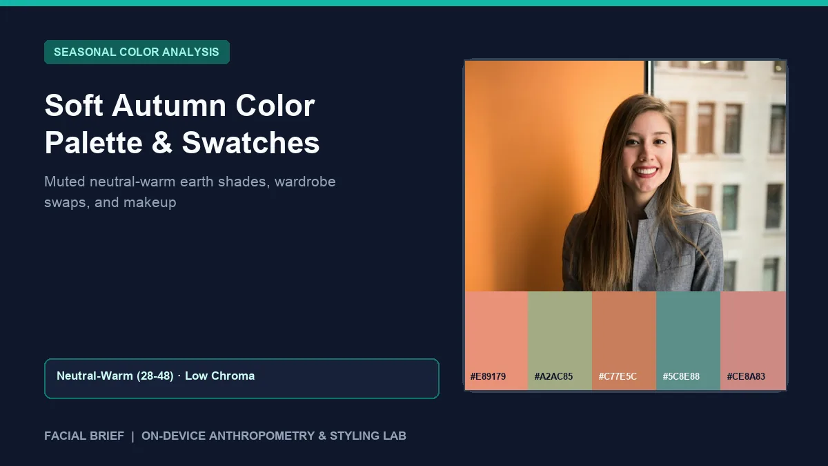
The soft autumn color palette sits at the warm, low-chroma border between Autumn earthiness and Summer softness, led first by gentle pigment muting and second by a neutral-warm undertone. Across r/coloranalysis and r/autumns, newly typed Soft Autumns frequently voice an immediate letdown when opening a swatch fan filled with oatmeal, sage, and dusty terracotta. Shoppers worry about wearing bland beige outfits every week until daylight cloth tests prove how quickly bright jewel tones overpower low-contrast skin while jet black casts dark under-eye shadows. Before clearing out your closet or buying new foundations, you can measure cheek warmth, complexion depth, and hair-to-skin luminance contrast from a daylight photo when you Run Color Analysis Free right in your browser.
Key Takeaways
- Low chroma leads the soft autumn color palette ahead of golden warmth, so shades carry subtle gray or brown softening instead of Spring brightness or Winter contrast.
- Facial Brief pixel sampling links Soft Autumn to neutral warmth (
28 to 48red-minus-blue difference), medium skin luminance (120 to 188), and low-to-medium hair contrast (< 95delta). - Signature shades center on warm salmon (
#E89179), sage green (#A2AC85,#6F8C7A), soft terracotta (#C77E5C), muted teal (#5C8E88), and warm rose (#CE8A83). - Oatmeal (
#E8E0D5), warm sand (#CBBBA0), taupe (#8B7765), and soft espresso (#5B4C43) clear jaw shadows far better than jet black (#050505) or optic white (#FFFFFF). - Satin-brushed bronze, antiqued brass, and matte rose gold match neutral-warm and olive skin better than mirror-shine yellow gold or bright chrome.
Colorimetry and Munsell Mechanics Behind Soft Autumn Colors
Within the Munsell color-order system, personal palettes balance hue (warm versus cool temperature), value (lightness versus depth), and chroma (saturation versus gray softness). While True Autumn prioritizes pure golden warmth, soft autumn colors prioritize mutedness. On the 12-season wheel, Soft Autumn borders Soft Summer, adding subtle neutral gray-brown to terracotta, peach, olive, and teal so fabric blends smoothly with low-contrast features.
In natural daylight, Facial Brief samples bare cheek and forehead regions and assigns Soft Autumn where skin warmth reads neutral (28 to 48 red-minus-blue difference), skin luminance sits in the medium band (120 to 188 on a 0 to 255 scale), and hair-to-skin contrast stays low to moderate (< 95 delta). Natural hair commonly spans dirty blonde, golden-ash brown, caramel chestnut, and mousy brunette, paired with hazel, green-amber, olive-brown, or warm gray eyes.
Olive skin creates regular typing confusion online, examined in this r/coloranalysis olive skin hypothesis thread. Because olive complexions carry a green-gray cast over neutral base pigment, light-to-medium olives often look tired in fiery orange yet thrive in eucalyptus sage (#6F8C7A) and clay rose (#B56357). Draping physical cloth beside a north-facing window between 10:00 AM and 2:00 PM avoids indoor LED shifts before paying $100 to $300 for an in-person studio ($75 to $150 online).
Soft Autumn vs. Soft Summer and True Autumn
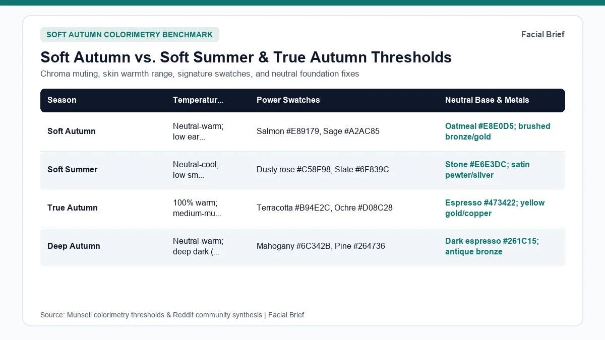
Border confusion around Soft Autumn clusters along two splits: neutral-warm versus neutral-cool muting against Soft Summer, and gentle softness versus heavier spice against True Autumn. The six-season comparison table below charts thresholds, hex codes, and drape tests.
| Season | Undertone & Temperature | Chroma & Contrast | Signature Hex Swatches | Neutrals & Dealbreaker Test |
|---|---|---|---|---|
| Soft Autumn | Neutral-warm (28 to 48) | Low earthy; < 95 delta | Salmon #E89179, Sage #A2AC85, Terracotta #C77E5C, Teal #5C8E88 | Oatmeal #E8E0D5, taupe #8B7765; white looks gray |
| Soft Summer | Neutral-cool (< 28 or cool-olive) | Low smoky; < 95 delta | Dusty rose #C58F98, Slate #6F839C, Cool sage #8FA395, Mauve #9E8494 | Stone #E6E3DC, charcoal #3C4352; camel turns sallow |
| True Autumn | 100% Warm (> 48, Y-YR) | Medium-muted; 48 to 95 | Terracotta #B94E2C, Ochre #D08C28, Olive #4E6E48, Teal #28666E | Espresso #473422, cream #E2D2B5; mauve washes out |
| Deep Autumn | Neutral-warm (> 48 or deep) | Medium chroma; < 120 lum | Mahogany #6C342B, Pine #264736, Aubergine #4D2C3D, Tomato #B43728 | Dark espresso #261C15, ivory #EFE8D6; pastels flatten |
| True Spring | 100% Warm (> 48) | High sunny; clear contrast | Coral #E06449, Leaf #4F9A69, Marigold #EB9E2E, Teal #4CA39C | Cream #F6EED9, camel #CCA06B; taupe dulls glow |
| Bright Winter | Neutral-cool (28 to 48) | Electric vivid; > 95 delta | Cobalt #1F4FC4, Red #D2202E, Fuchsia #D6218C, Emerald #0E8C5A | Optic white #FFFFFF, black #0E1015; oatmeal drains |
Separating Soft Autumn from Soft Summer
Telling these two muted seasons apart sparks frequent debate in this r/coloranalysis thread differentiating Soft Autumn and Soft Summer and this r/coloranalysis Soft Autumn vs. Soft Summer comparison. Testing extreme orange against hot pink fails because high saturation overwhelms both groups equally.
Instead, drape muted mid-tones in daylight: hold warm salmon (#E89179) and olive sage (#A2AC85) against cool slate blue (#6F839C) and smoky mauve (#9E8494). On Soft Autumns, olive sage calms redness and restores healthy warmth, while slate blue leaves skin gray. Compare cool muted swatches in our soft summer color palette guide or inspect contrast scores inside Facial Brief's 42-Metric Full Report.
Separating Soft Autumn from True Autumn and Deep Autumn
Against True Autumn, pigment density decides the call. Place saturated pumpkin terracotta (#B94E2C) or ochre (#D08C28) beneath your jaw beside muted terracotta (#C77E5C) and eucalyptus sage (#6F8C7A). True Autumns sharpen under denser spice, while Soft Autumns notice strong orange sitting ahead of their eyes. Check stronger spice tones in our true autumn color palette guide, darker value in our deep autumn color palette guide, or opposite high-chroma contrast in our bright winter color palette guide.
Building a Soft Autumn Wardrobe Palette Without Palette Fatigue
Read r/coloranalysis for a week and one reaction repeats constantly: initial disappointment with muted neutrals. Posts like this r/coloranalysis thread on feeling let down by Soft Autumn and this r/autumns discussion on feeling dull in muted tones show why fans packed with beige feel flat at first glance.
Breaking the Beige Trap and Keeping Edge Without Black
Regulars beat palette fatigue by replacing plain tan basics with muted colors and varied fabric textures. A functional soft autumn wardrobe palette follows three habits:
- Lead with colorful muted staples: muted teal (
#5C8E88), dusty sea-glass blue (#557282), moss green (#7E8A5A), warm rose (#CE8A83), and clay berry (#945F70) bring clear color without neon glare. - Replace optic white (
#FFFFFF) and pitch black (#050505) near the chin with oatmeal (#E8E0D5), warm sand (#CBBBA0), moss charcoal (#49564E), and soft espresso (#5B4C43). - Use surface texture instead of stark contrast: washed linen, brushed cashmere, ribbed knitwear, suede, and corduroy add visual structure to monochromatic outfits.
Wearers with dark minimalist wardrobes hit extra friction dropping black, covered in this r/coloranalysis thread for Soft Autumns with high-contrast taste. Keep black trousers, skirts, and boots below the waist, then pair open necklines, antique brass chains, or olive scarves near the collarbone to buffer black edges. Shoppers in this r/capsulewardrobe thread on stores for Soft Autumn recommend Quince, Banana Republic, and J.Crew for oatmeal knits and olive tailoring, alongside physical swatch fans from True Colour International (TCI) and NDU Colors.
Hair Coloring, Metals, and Eyewear
Natural Soft Autumn hair rarely hits blue-black or icy platinum. Staying within two levels of your base via golden-brown, warm bronde, muted caramel, or ash-bronze balayage keeps soft contrast without brassiness. Test bronde or chestnut glosses on your portrait using Facial Brief's Hair Color Try-On.
Metal finish shapes harmony just as much as alloy hue for olive wearers debating gold vs. silver in r/coloranalysis and this Soft Autumn jewelry guide. Satin gold, hammered brass, rose bronze, and matte silver blend smoothly alongside amber, smoky quartz, or warm tortoiseshell frames.
Soft Autumn Makeup Colors, Lipstick Picks, and Cheek Formulas
Beauty counters split awkwardly for Soft Autumns: warm tubes lean glaring orange-coral, while cool shades pull icy pink or gray mauve. Choosing soft autumn makeup colors takes muted, earthy-rose pigments that look lived-in rather than painted on.
Reviewers across this r/coloranalysis Soft Autumn lipstick guide and this r/coloranalysis Soft Autumn blush thread flag one quick filter: if a shade looks bright enough to enter the room ahead of you, saturation is too high. Favorites include:
- Lips: MAC Brick-O-La serves up muted warm rose-berry, while MAC Marrakesh delivers deep earthy brick when blotted down with a finger. Drugstore fans favor L'Oreal Colour Riche Ultra Matte in No Obstacles and dusty terracotta balms.
- Cheeks: Tower 28 BeachPlease in Magic Hour and Rush Hour melt cleanly into bare skin, alongside Merit Flush Balm in Beverly Hills, Dior Rosy Glow in Toffee, and sheer NARS Orgasm.
- Eyes and base: Trade wet black liner for espresso brown mascara, bronze-taupe shimmer, olive-khaki crease shades, and satin skin tints.
See how Soft Autumn wear-and-avoid swatches pair with facial proportions on our sample facial report.
Frequently Asked Questions
What colors make a Soft Autumn look washed out or tired?
Stark optic white (#FFFFFF), solid jet black (#050505), electric pink (#FF1493), neon cyan (#00E5FF), and icy lavender clash directly with Soft Autumn coloring. Extreme black-and-white contrast casts gray shadows beneath the eyes and sharpens fine lines across cheeks, while high-saturation neon dyes pull focus straight to the collar, flattening subtle neutral-warm skin glow across harsh indoor bulbs, bright glare, and indirect north-facing daylight.
Can a Soft Autumn wear gold or silver jewelry?
Brushed yellow gold, rose bronze, antiqued brass, and matte rose gold match Soft Autumn warmth most reliably because satin finishes soften bright shine and mirror muted skin tones. Because Soft Autumn sits right along the Soft Summer cool-neutral border, olive-skinned Soft Autumns can also wear brushed or oxidized sterling silver cleanly alongside warm natural stones like amber, citrine, tiger eye, or smoky quartz.
How do I tell Soft Autumn apart from Soft Summer?
Hold muted warm salmon (#E89179) and sage green (#A2AC85) against cool slate blue (#6F839C) and dusty mauve (#9E8494) beneath your jaw in indirect north-facing daylight without wearing makeup. When salmon and sage calm cheek redness and soften under-eye darkness while slate blue casts a flat gray tone across your chin and lower cheeks, your undertone sits comfortably in Soft Autumn rather than Soft Summer.
What are the best everyday soft autumn makeup colors for lips and cheeks?
Focus on muted rose-terracotta, spiced peach-brown, and soft brick tones instead of bubblegum pink, frosty lilac, or opaque traffic-cone orange. Community favorites include MAC Brick-O-La, L'Oreal No Obstacles, or finger-blotted MAC Marrakesh on bare lips paired cleanly with Tower 28 Magic Hour, Merit Beverly Hills, or Dior Toffee across the cheeks, finished softly with espresso brown mascara instead of stark jet-black liquid eyeliner.
Referenced Community Discussions & Sources
- r/coloranalysis: Dealing with initial disappointment over Soft Autumn beige palettes: Covers moving past neutral beige fatigue using muted teal, rose, and moss.
- r/autumns: Fixing the dull feeling inside a Soft Autumn closet: Recommends linen, suede, deeper berry tones, and True Autumn borrowing.
- r/coloranalysis: Core colors that separate Soft Autumn from Soft Summer: Contrasts warm olive and terracotta against cool hazy blues and mauves.
- r/coloranalysis: Styling a dark or high-contrast wardrobe as a Soft Autumn: Details open necklines, black below the waist, and antique brass.
- r/capsulewardrobe: Recommended retail stores for Soft Autumn capsule clothes: Lists Banana Republic, Quince, J.Crew, and physical TCI/NDU fans.
- r/coloranalysis: Gold vs. silver jewelry choices for olive Soft Autumns: Compares brushed yellow gold, rose gold, and satin silver.
- Colorimetry Standards: Munsell Color-Order System (ASTM D1535) hue, value, and chroma parameters alongside CIE Rec. 709 relative luminance calculation.
Paired Facial Brief Analyzer
Measure your own proportions on-device
Run private 478-point landmark geometry in your browser with zero server photo upload on free tools.
Continue Reading