Light Spring Color Palette: Colors, Wardrobe & Makeup
Explore the light spring color palette with hex swatches, light spring makeup colors, warm wardrobe neutrals, and a 6-season draping comparison table.
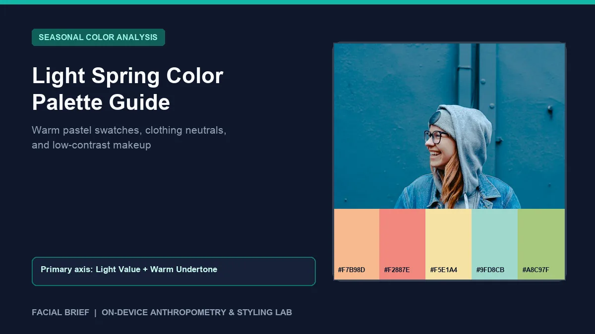
The light spring color palette occupies the sunlit, low-contrast edge of the 12-season colorimetry wheel, led first by lightness (high value) and second by warm golden undertone. On seasonal styling forums like r/SpringColorAnalysis and r/coloranalysis, newly typed Light Springs frequently share two frustrations: assuming the season forces a closet full of Easter-egg pastels, or noticing that everyday black sweaters, charcoal coats, and cool mauve lipsticks leave their skin looking tired. Swapping heavy matte shades for fresh peach, warm ivory, and light aqua restores brightness around the eyes immediately. Before buying new fabrics, Run Color Analysis Free from a natural window-light selfie to check your visible skin undertone, facial luminance, and contrast band.
Key Takeaways
- Light Spring combines high value (lightness), warm yellow-based undertone (Munsell Y, YR, and warm GY axes), and clear chroma softened with white instead of gray.
- Signature pigments center on soft peach (
#F7B98D), light coral (#F2887E), buttercream yellow (#F5E1A4), light aqua (#9FD8CB), and clear spring green (#A8C97F), balanced by warm ivory (#FAF3E3) and warm sand (#D5BFA2). - Jet black (
#141416), charcoal slate (#4F5B68), deep burgundy (#5D202B), and heavy espresso (#38251C) overpower delicate low-contrast features and cast gray shadows beneath the jaw. - Light champagne gold and warm rose gold jewelry integrate cleanly with warm light skin, whereas dark oxidized metals or bright chrome silver pull focus away from the eyes.
- Sheer, luminous finishes beat flat matte makeup: peach blush, blotted coral lip tints, and soft brown mascara preserve natural lightness far better than jet-black liner or blue-pink lipstick.
Munsell Colorimetry Behind Light Spring Colors
Twelve-season personal color analysis translates Albert Munsell's three-dimensional color model into wearable pigments: hue (warm vs. cool temperature), value (lightness vs. darkness), and chroma (clarity vs. grayed mutedness). For light spring colors, value sits at the top of the chart. Pigments contain high white content, keeping colors airy and weightless while retaining an unmistakable drop of golden yellow warmth.
That white-tinted clarity separates Light Spring cleanly from muted autumn seasons. When paint makers soften a hue with gray or brown, it creates earthy, dusty tones suited to Soft Autumn or Soft Summer. When they brighten a warm hue with white, it yields warm peach (#F7B98D), daffodil (#EFE07B), and fresh mint leaf (#95CFA4). Across Facial Brief's natural-light pixel measurements, Light Spring profiles typically show gentle red-over-blue cheek warmth alongside high facial luminance (175 to 230 on a 0 to 255 scale) and low hair-to-skin luminance contrast (20 to 52 delta). Because hair, eyebrows, lashes, and iris contrast remain delicate, dark heavy garments pull visual attention down to the collar instead of framing the face.
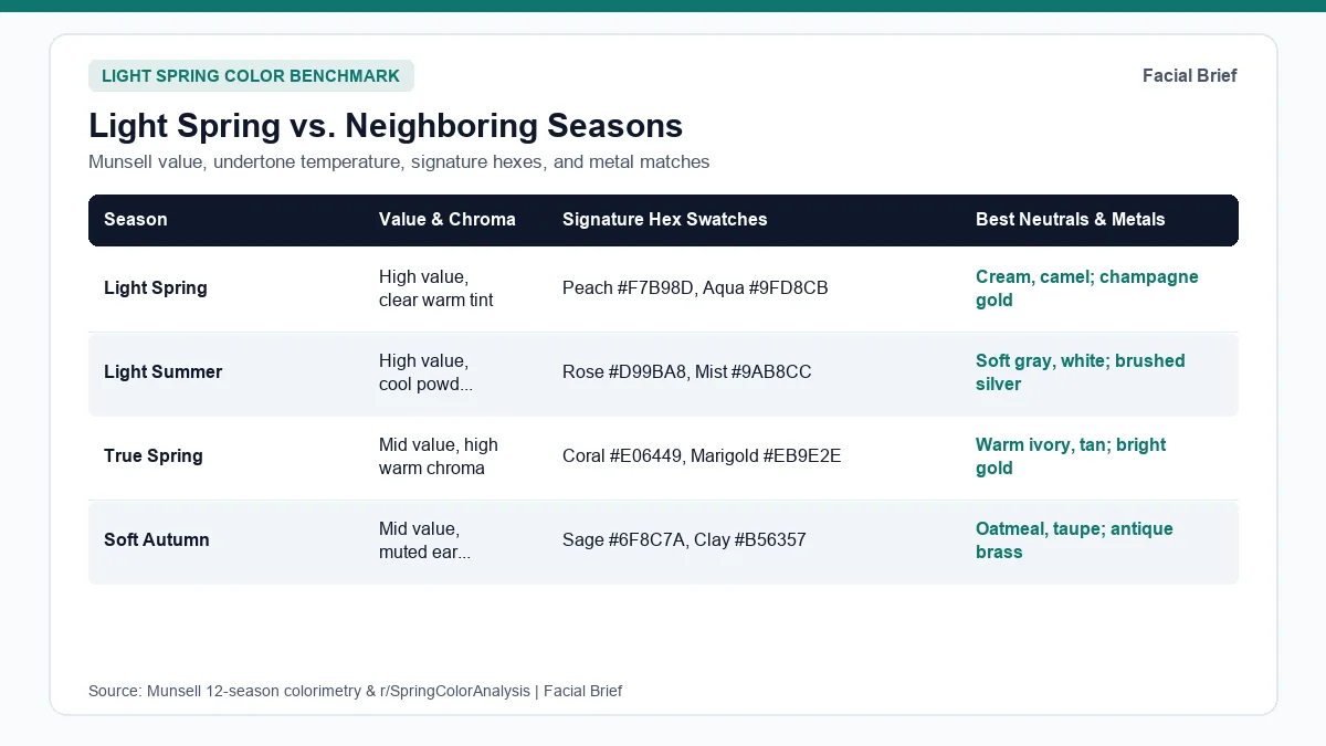
Light Spring vs. Neighboring Color Seasons
Border confusion happens constantly among light and warm palettes. Shoppers routinely confuse Light Spring with cool Light Summer (both share high lightness), warmer True Spring (both share golden warmth), or muted Soft Autumn (both sit near low-to-medium contrast). The table below maps these neighboring seasons across value, chroma, exact hex references, and metal pairings.
| Color Season | Primary Trait | Value & Chroma Profile | Signature Wear Swatches | Recommended Neutrals & Metals | Common Mis-Typing Trap |
|---|---|---|---|---|---|
| Light Spring | Light value first, warm second | High value, clear white-tinted chroma | Peach #F7B98D, Coral #F2887E, Aqua #9FD8CB, Butter #F5E1A4 | Warm ivory, camel, soft navy; champagne & rose gold | Mistaken for Soft Autumn or Light Summer in dim indoor light |
| Light Summer | Light value first, cool second | High value, powdery cool chroma | Rose pink #D99BA8, Powder blue #9AB8CC, Lilac #B9B2D8 | Soft gray, cool white, cocoa; brushed silver | Gray-based baby blues look slightly chilly on warm Light Springs |
| True Spring | Warm golden hue first | Medium value, high saturated chroma | Clear coral #E06449, Grass green #4F9A69, Marigold #EB9E2E | Warm cream, golden tan; bright yellow gold | Blazing orange and saturated cobalt overpower light low contrast |
| Bright Spring | High clarity first, warm-neutral | Medium value, vivid neon-bright chroma | Electric coral #F24444, Emerald #00A676, Bright sky #1F78D1 | Warm white, charcoal navy; bright gold or silver | High-contrast brights swallow soft pastel Light Spring features |
| Soft Autumn | Muted gray-warmth first | Medium value, low dusty chroma | Sage #6F8C7A, Clay rose #B56357, Warm taupe #8B7765 | Oatmeal, brushed taupe; antiqued bronze & brass | Dusty gray-green sage drains clear Light Spring complexion |
| True Autumn | Rich golden earth hue first | Medium-dark value, muted spice chroma | Terracotta #B94E2C, Ochre #D08C28, Deep teal #28666E | Espresso, olive moss, camel; hammered yellow gold | Dark rust and heavy olive sit too heavy on Light Spring skin |
Separating Light Spring from Light Summer, True Spring, and Soft Autumn
Reddit threads track three recurring boundary debates. First is Light Spring versus Soft Autumn, analyzed closely in r/coloranalysis Light Spring vs. Soft Autumn comparisons. Compare celebrity benchmarks or fabric swatches under soft north-facing window light between 10:00 AM and 2:00 PM: dusty sage (#6F8C7A) and muted brown-rose harmonize on a Soft Autumn, whereas Light Springs look flat or sallow until swapped into crisp pistachio (#A8C97F) or warm peach.
Second is Light Spring versus Light Summer, discussed in r/SpringColorAnalysis basics reviews. Because both share lightness as their dominant axis, Light Springs can borrow select Light Summer tones (such as soft periwinkle or clear sky blue) more easily than dark winter hues. Test clear warm aqua (#9FD8CB) beside dusty lavender-gray: if the gray undertone makes under-eye circles look blue, stick strictly with warm yellow-based pastels.
Third is Light Spring versus True Spring, debated across r/SpringColorAnalysis border evaluations. Hold saturated marigold (#EB9E2E) next to soft buttercream (#F5E1A4): True Springs brighten in deep saturated warmth, while Light Springs look slightly eclipsed behind loud neon-bright shades. If you want to verify how deep earthy tones compare on the warmer autumn side, inspect our true autumn color palette guide or view cool muted values inside our soft summer color palette guide. Inside Facial Brief's 42-Metric Full Report, skin luminance and contrast scores pair directly with a 10-wear and 5-avoid seasonal card.
Building a Light Spring Wardrobe Palette in Real Stores
Knowing your fan on screen is one thing; walking into retail racks stocked mostly with black, optic white, and muted beige is another. Across r/SpringColorAnalysis real-life shopping threads and what-to-avoid discussions, shoppers share a simple compromise rule when exact swatches are scarce: prioritize lightness first and warmth second, keeping dark or cool pieces below the waist on trousers, shoes, and bags.
For a practical light spring wardrobe palette, build your foundational neutrals from creamy ivory (#FAF3E3), champagne (#EAE0CA), warm sand (#D5BFA2), light camel, cocoa brown (#7B6C5C), and soft marine navy instead of stark black or cool charcoal. On coats and outerwear, r/coloranalysis Light Spring coat guides highlight camel-oatmeal wool trenches, light stone trench coats, and warm dusty-aqua spring jackets as far easier daily anchors than jet-black wool.
Texture changes how identical hues read against light skin. Multiple community threads note a "need to shine" rule: crisp cotton poplin, silk-satin blends, fine-gauge cashmere, linen-viscose drape, and subtle pearlized knits echo natural Light Spring brightness better than thick, matte boiled wool or heavy distressed denim. Pair tops in soft peach, coral pink (#EA8876), mint leaf, or warm periwinkle (#95ACE0) with delicate champagne gold or rose gold chains instead of heavy oxidized brass. Hair shade fits the exact same contrast budget: honey blonde, strawberry blonde, golden apricot, and warm light bronde harmonize naturally, whereas cool ash platinum or jet-black dye creates harsh root lines (test subtle warm shifts safely with Facial Brief's Hair Color Try-On or preview complete report layouts on our sample facial report).
Light Spring Makeup Colors: Lips, Cheeks, and Eyes
Department-store makeup displays tilt heavily toward cool mauve neutrals, deep burgundy reds, and jet-black mascaras that overwhelm delicate warm contrast. Updating light spring makeup colors delivers the fastest everyday payoff before altering a single piece of clothing.
As detailed across r/SpringColorAnalysis makeup threads and r/coloranalysis Light Spring lip and cheek recommendations, the overarching rule is luminous sheerness over heavy opacity:
- Base and cheeks: Use a satin or dewy skin tint matched to neutral-warm golden skin instead of chalky full-matte foundation. Skip cool taupe contour sticks that leave muddy gray streaks along the cheekbone; swap in sheer light golden bronzer and creamy peach, apricot, or warm coral-pink blush melted softly into the apples of the cheeks.
- Eyes and lashes: Replace harsh jet-black liquid liner and pitch-black mascara with soft brown, warm espresso, or bronze-brown formulas so eyelashes frame the iris gently. Wash lids in champagne shimmer, pale peach, light warm taupe, or soft copper instead of smoky charcoal or icy silver shadow.
- Lips: Skip cool blue-based pinks, dusty mauves, frosted lilacs, and dark wine shades that turn flat or separate visually against warm light skin. Reach for sheer peachy-nudes, warm watermelon glosses, coral-pink balms, or bright warm coral lipstick tapped lightly with a finger for a translucent blotted stain.
Frequently Asked Questions
Can a Light Spring still wear black or pure white?
Jet black (#141416) and stark optic white sit at opposite ends of harsh contrast for delicate warm coloring, making under-eye shadows and jaw contours look heavier than intended. Keep true black items safely below your waist on pants, skirts, or footwear, and shift tops and scarves near your face toward warm ivory (#FAF3E3), champagne (#EAE0CA), light camel sand, or soft marine navy.
How do I tell Light Spring apart from Light Summer?
Test undertone warmth beside a north-facing window in clear morning daylight without wearing foundation or lipstick. Hold warm soft peach (#F7B98D) and buttercream yellow (#F5E1A4) under your chin, then swap in cool dusty rose and grayed lavender-blue. Light Springs gain healthy cheek glow and brighter eye whites in yellow-warmed pastels, whereas icy grayed shades flatten Light Spring skin and flatter Light Summer instead.
Which makeup mistakes clash most with a Light Spring complexion?
Cool blue-pink or dusty mauve lipsticks, heavy jet-black liquid eyeliner, gray-taupe contour powders, and flat full-coverage matte foundations create harsh visual separation against light golden skin. Swapping to soft brown mascara, luminous dewy skin tints, cream apricot blush, warm champagne lid washes, and blotted warm coral lip balms restores soft, cohesive facial brightness within minutes without looking overly heavy or painted.
What hair colors flatter Light Spring skin tones best?
Warm golden blonde, honey blonde, strawberry blonde, pale copper-blonde, and soft golden light brown match Light Spring's high luminance and gentle natural contrast cleanly without harsh lines. Avoid cool ash platinum, purple silver toners, and blue-black box dyes, which introduce gray shadows around the mouth and force heavier daily makeup just to rebalance stark dark roots against fair, warm-toned skin.
Referenced Community Discussions & Sources
- r/SpringColorAnalysis: Core Light Spring palette basics and clear pastel rules: Breaks down lightness first, warmth second, and clear white-tinted hues free of heavy gray.
- r/coloranalysis: Distinguishing Light Spring from Soft Autumn: Contrasts clear warm clarity against dusty gray-muted earth pigments using real-world draping checks.
- r/SpringColorAnalysis: Real-life Light Spring shopping compromises: Recommends prioritizing light value and subtle fabric sheen when retail racks skew cool or neon.
- r/SpringColorAnalysis: Colors that overwhelm Light Spring contrast: Details why black, charcoal, deep wine, and heavy matte textures cast harsh facial shadows.
- r/coloranalysis: Best Light Spring coat and neutral anchor colors: Compares camel, oatmeal, stone ivory, and soft aqua outerwear against dark winter coats.
- r/SpringColorAnalysis: Everyday Light Spring makeup colors and brown mascara swaps: Lists peach blush, coral lip tints, and champagne eye shadows tailored to low-contrast warm skin.
- r/coloranalysis: Translucent coral and blotted lip techniques for Light Springs: Covers sheer luminous finishes over opaque cool mauves and dark berries.
- Munsell, A. H. (1905 / revised ASTM D1535): Color-order framework separating hue, value, and chroma axes in 12-season personal color analysis.
Paired Facial Brief Analyzer
Measure your own proportions on-device
Run private 478-point landmark geometry in your browser with zero server photo upload on free tools.
Continue Reading